In a previous post we talked about best practice homepages but there are many different homepage layouts you could choose from and still be colouring between the lines of best practise. Every business is different, so the layout of your home page should best represent your business while still nailing best practice.
Get all your homepage content ready
A good place to start when planning the layout of your homepage is to think about the key information and content you want presented on the homepage. This might include:
- Your logo
- One or multiple images or a video
- Your main heading (H1)
- Some introductory text
- Call to action buttons, phone number and/or prompts to buy online
Preparing all your content first is the same process a web designer goes through when designing a home page, as it helps them prioritise the different content based on it’s importance on the page. It’s a bit like the way a chef prepares all the ingredients before making a dish. It makes the process more efficient and it’s less likely you’ll forget an ingredient. Simple logic dictates where certain content should go. For example, you wouldn’t put your logo at the bottom of your page as the logo is the way people find out which website they’re on and people expect it to be at the very top of the page. The website’s navigation menu is much the same - people expect it to be at the top of the page. You wouldn’t put your call to action buttons at the top of the page as visitors haven’t learnt anything about your business yet and it’s a bit premature to ask them to make contact with you or even click through to one of your other pages. For other aspects of the layout it gets a little trickier.
Images influence your homepage layout
The main thing that determines how a home page should be laid out is your images/video.
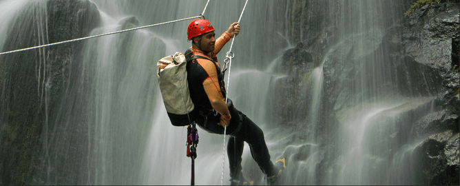
Do you have great images or video?
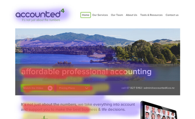
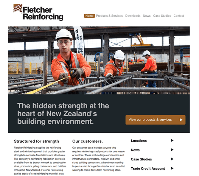
Are you a business that has stunning images which attractively represent your business? For example like a photographer or adventure tourism business. It would make sense to have a large full page width photo slideshow near the top of your page, below the logo/menu. These images are eye catching and hook visitors in so that they’re more likely to read content on your homepage or even click to find out more.
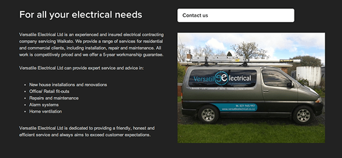
Your images are more functional than fantastic?
For many businesses, their images are plain and not particularly exciting. It’s still important to have something visual on the page otherwise the design will be uninteresting. However, a large home page slideshow of images probably isn’t the best use of your prime real estate at the top of the page if your photos aren’t strong. Maybe a single, half page width image showing off your business in some way would be more effective. Ideas for showing off your business is a photo of your place of business, signage, sign written vehicles, smiling team etc - something that shows you’re a real business they can trust. You can then use the other half of the page to bring your main heading, intro blurb and call to action button further up the page.
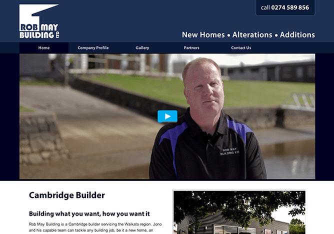
What about video?
Video can be a great way to explain what your business does in a visual and engaging way in a couple of minutes. While it’s hard to get people to read text on a website, web visitors love watching a video (so long as it’s not too long). There are a few ways to include a video on your website.
If you have a video that you don't want to be really large on your home page and take up too much visual real estate, you could put the video in a 1/3 of the page width column in a two column layout, with text and a heading to the left of the video.
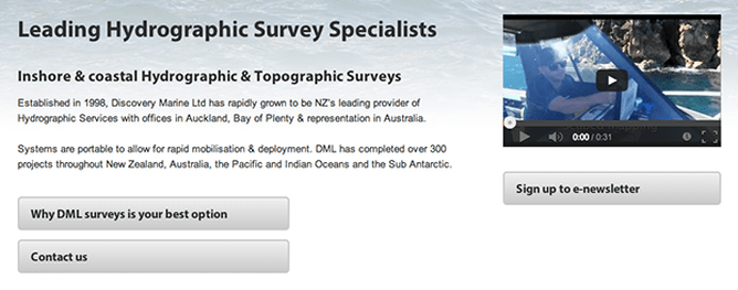
If you don’t have great images but your video is great, you could put a full page width video at the top of the page instead of a slideshow. This makes it clear to the visitor that they should watch the video as soon as they arrive at the site.
Don’t make text go the full width of the page
It can be tricky to get website visitors to read text on your website. If you make your lines of text go the full width of the page, it’s harder for people to read. The eye likes short lines of text. This means putting text in columns that are ⅓, ½ or ⅔ the width of the page. Here are some ideas of how to balance the column of text with some other piece of content so there’s no wasted space on the home page:
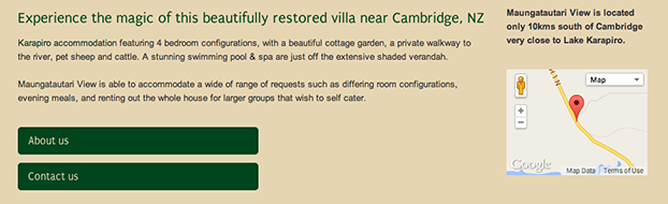
If you’re a shop or business that requires people to visit your premises, this might be one of the main reasons people are accessing your website. Having a small map on your homepage can make it fast and simple for visitors to locate you:
Put your most important content at the top
Eye tracking studies show that people look at the top left of a web page the most and move on a left to right, top to bottom progression - in the shape of an F. So how does this learning apply to your homepage layout? If you have a large image or slideshow at the top of your page, the next place someone will look is below that on the left hand side, so putting a big heading block in this position would be a good idea. Ideally you should be able to explain what your business does in one line of text but if you can't fit it on one line, two lines is still ok. Any longer than that and it's too much hassle for the visitor and they'll skip over it.
Here’s a simulation of an F pattern heatmap and to see real life eye tracking examples go here: http://www.nngroup.com/articles/f-shaped-pattern-reading-web-content/
Big heading
As we’ve already talked about above, maybe images aren’t your best asset. So you might put a big heading at the top left of your homepage. The idea of the big heading is that it hooks the visitor in and makes them want to read the text directly below it. This text should introduce someone to your business who doesn’t know anything about you - make it punchy as web visitors can be impatient. One to two paragraphs is about all that your average web visitor can manage in one hit before you should either prompt a call to action (button or other) or have another smaller heading and another section of text on the page. Google only likes you using one big heading (also known as an H1) per page.
Some homepages only need a few paragraphs of text to explain what you do and why someone should choose you but other homepages need to get a more information across on the homepage. The next section will talk about a few techniques to break up longer homepages.
Breaking up longer homepages - how to add visual interest
If you have quite a bit of information to get across on your home page, one option is to break the content into bite sized chunks, each with a descriptive heading and associated image. You can put a line break stack between each section if you need more visual separation. Alternating the side the image and the text are on with each section can also add visual interest and keep the reader engaged. Remember that most readers scan the headings, so don’t put too much text under each heading and make the headings really punchy and descriptive.
Something else you can use to break up longer home pages are call to action buttons. Think about different sections on your home page (heading & paragraph) as being short snippets of content about different aspects of your business. These short snippets are probably represented elsewhere on your website in more detail. As you’re trying to attract the attention of scanners with good headings, if a heading does catch their attention and they read the paragraph under the heading, it’s likely they’ll want to know more about this particular topic. That’s why it’s a good idea to have a call to action button that links to the page with more information about that topic.
Make it easy to contact you but don’t pick the fruit before it’s ripe
A common mistake with call to actions on the homepage is to ask visitors to make contact before the visitor’s learnt enough about what you do and why they should choose you. You will get more leads if you persuade visitors why they should choose you before you ask them to contact you.
How to persuade visitors to choose you
Show that you’re trustworthy and a real business - good images of you, your staff, place of work etc. Explain how you’re different to your competitors and what makes you unique. Show that you know what you’re talking about by writing blog post articles which demonstrate your knowledge and expertise. Display testimonials from satisfied customers and visual examples of your work if you have them.
Not all of these things can be done on the home page. The point here is that it might be more important to guide the visitor to some of this other content on your website before actively asking them to contact you. Having your phone number on your homepage is often just a way to help returning customers find your phone number quickly and this is different to having a call to action that asks visitors to contact you.
Selecting the right home page content and layout can be daunting. The above guidelines and our 5 steps to an effective homepage should have you well on your way to a homepage which looks great and gets results.
If you haven't tried Rocketspark's website builder, our stack layouts make it very simple to layout and try different options quickly.
Build your website in New Zealand
Build your website in Australia
Build your website in United Kingdom