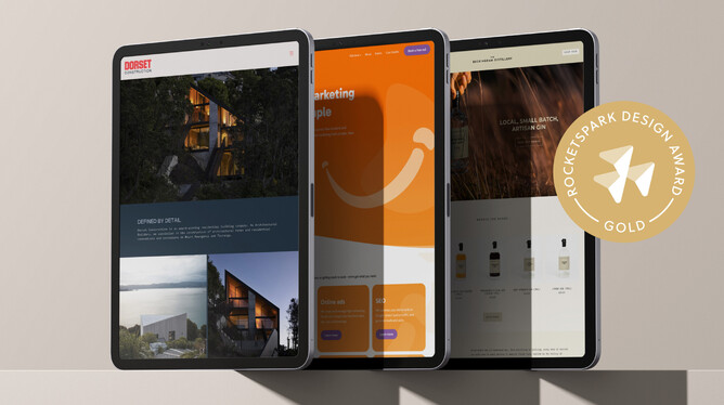
Have you ever imagined what it feels like to design a website that wins a Gold or Silver Rocketspark Design Award? Each month, when we send out our Rocketspark Partner newsletter, the Design Awards section is one of the most-clicked — as designers check to see if their latest website has been celebrated for design excellence.
The Rocketspark Design Awards exist to celebrate beautiful, thoughtful, and user-focused website design within our designer community. They recognise creativity, usability, and craftsmanship — raising the bar for design quality and inspiring others to keep pushing their creative boundaries.
Every website is reviewed using a structured points system to make sure judging is consistent, fair, and focused purely on design excellence.
Here’s how the scoring works:
🥇 Gold Award: 43 points or higher
🥈 Silver Award: 40–42 points
To keep judging balanced and fair, Tyron and Jeremy co-judge the Rocketspark Design Awards — reviewing every site individually and together so each one is assessed through the same lens. Their combined eye for detail blends creative appreciation and technical precision, ensuring every design is judged to the same high standard.
Websites that achieve a Gold or Silver Award are showcased across our website, newsletters, and social media, giving designers well-deserved recognition in front of thousands across the Rocketspark community.
A peek behind the curtain — the secret sauce to winning a Rocketspark Design Award is no longer a secret
If you’ve ever wondered what it takes to get your website recognised, we’re pulling back the curtain on exactly how we judge. You might find your designs are closer to a Gold or Silver than you think — it’s often one or two tweaks that make all the difference.
Each month we see incredible sites with strong creative direction that fall short because of small issues. These awards are a showcase of exemplary web design — and being transparent about our process helps everyone level up.
How we judge the Rocketspark Design Awards
To be considered for a Rocketspark Design Award, please send cookies to… just kidding — nom nom nom 🍪🍪🍪.
Our judging process is formal, transparent, and fair — designed to take personal preferences out of the picture.
Every partner website that’s upgraded or launched during the month is automatically entered into the Rocketspark Design Awards Judging Process, led by Tyron and Jeremy. Each site is reviewed against our five judging categories, with up to 10 points per category, for a total of 50 possible points.
We use this framework to evaluate both best-practice and creative craft — balancing technical clarity with creative flair.
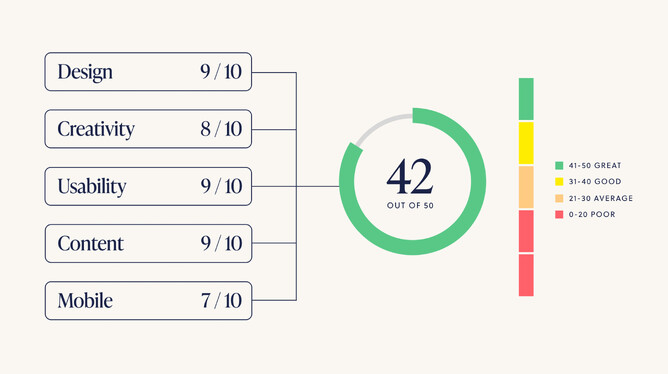
We judge websites across 5 categories with a maximum potential score of 50 points based on:
Design
Creativity
Usability
Content
Mobile
We use this criteria to fairly and accurately judge all aspects of best practice and creative website design to ensure that we are selecting websites for technically correct reasons—balancing creative flair with best practice visual communication in a way that’s judged consistently for everyone. For the websites that don’t end up winning a Rocketspark Design Award, we see a lot of the same web design mistakes. These mistakes often have quick and easy solutions to correct them, such as spacing, text treatment and hierarchy—it’s just knowing how to apply it to your own design.
Content is also a factor (text and photos). It can be tempting to blame the client for the content they’ve supplied but the winning sites typically manage to persuade the client to use a professional writer and photographer. Using our judging criteria below might just give you the insights you need to put your next website in contention for being a finalist or winner.
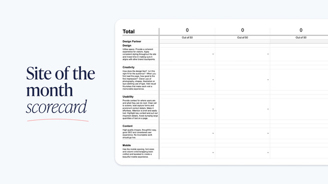
The details of our 5 judging categories
To judge the websites, we’ve created a score card that tallies up the points from each category to a total score.
So as a reminder, there’s 5 categories, 10 points on offer per category, to a maximum of 50.
Design (judged out of 10)
How the design utilises space
Everything is generously and evenly spaced and there are visual breaks between content so it’s clear when one section of content ends and another starts. Effective use of negative space has been applied to add emphasis to important elements of the design.Does it provide a coherent experience for its visitors?
Does the design make the website easy to use and is it clear what its purpose is?Is there consistent styling applied throughout the website?
All headings and paragraphs utilise consistent typeface sizes and styling. The same colour palate is used throughout the design. All buttons are unified in size and style making all calls to actions clear. Each page of the website is unified so it feels like you are still on the same website no matter what page you are on. The illustration and graphic styles are consistent in style.Does the website design align with other brand touchpoints?
The website design, colour and theme reflects existing design elements. The website's colour palette aligns with the logo and branding.
Creativity (judged out of 10)
How does the design feel?
The website is emotive and has a clear theme/mood which is derived through colour, illustrations, photography and typography. The design breaks the standard and predictable layout options.Is it the right brand positioning fit for the audience visually?
This becomes clear if the designer and client understand who the end user is for the website. The audience could be based on age, profession, interest, industry etc.When you first load the page, is the first impression good?
The website is captivating and engaging from the moment it is first loaded. The purpose of the website is clear. Impactful first impressions can be created through captivating photography, clever use of typography or just strong focal points.Is there clever use of photography, shapes, illustration or eye-catching use of type?
The design makes use of typefaces that add value to the theme of the website. The website uses professional, custom photography that is tailored to the theme of the website. The designer has created custom illustrations and icons that are unique to the website as opposed to downloading free stock alternatives.Is there added visual flourishes that make each page memorable?|The designer has created custom stack backgrounds and stack transitions. It uses lottie animations and/or video in a memorable way.
Usability (judged out of 10)
Provide context for where users are and what they can do next
It is clear what actions the end user needs to take if they want to engage with the website. The website is easy to navigate and it is obvious what page they are on.Clear call to actions, lead capture forms and prominent contact details
The calls to action are short, sharp and to the point whilst being descriptive of what happens next if clicked. All contact details are where you’d expect to find them and it is clear who you are contacting. The lead capture forms are capturing all relevant and necessary information.Highlight key content and pull out important details
Each section of content makes use of clear headings and subheadings. There is a clear hierarchy of content prioritising what’s most important to the user early in their journey of experiencing the website.Avoid dumping large quantities of text on a page
Each section of text content is short, punchy and to the point as using large bodies of text on a page is a quick way to lose user engagement. All body text is left aligned and uses optimal line lengths for best practice web design. The body text typeface choice is easily readable due to its style, weight and colour.
Content (judged out of 10)
High-quality images
There are no blurry images on the website, which includes the logo, stack backgrounds, photos and illustrations/icons. Photos at the standard of those taken by a professional photographer score much higher than photos that have a DIY feel about them.Thoughtful copy
Great copy on a website stands out and improves the experience of the website.Typically this kind of copy has been written by a professional copy writer or the designer has made use of Chat-GPT to create meaningful content that enhances the overall experience for the user and helps tie the words and visuals of the website together. If you’re relying on content supplied by clients you’re putting yourself at a disadvantage here.Good SEO and considered user experience
Heading and title tags have been added to each page of the website to enhance the websites searchability online for organic traffic.No incomplete work should go live
There are no broken links, no spelling mistakes, no lorem ipsum or stock photo placeholder content.
Mobile (judged out of 10)
Has the mobile spacing, font sizes and column order/wrapping been crafted and tweaked to create a beautiful mobile experience?
Rocketspark translates the desktop website to the mobile website pretty well straight off the bat, but even so, mobile should never be left as an afterthought. All the content should be evenly spaced on mobile so it’s still clear to distinguish sections, there aren’t any long words that are broken in half (text wrapping), especially in headings. Detailed stack backgrounds that have text overlayed on desktop should either be hidden or replaced with a solid colour for mobile to simplify the design for the small screen.
Is it your turn next month?
Winning a Rocketspark Design Award is a very real and achievable goal if you tick the box on all of the best practice points of web design listed above. Adding flair and personality to the design that speaks to its audience through colour, type and images will continue to increase your chances for producing a beautiful website.
If you already have a background in graphic or brand design, chances are you already have a great eye for design, and it's just about learning a new way to lay out content on a web page. For people who are new to design who are starting their design journey with websites, nailing all the basics of best practice web design and knowing what mistakes to avoid will make you a better designer and increase your chances of being recognised for site of the month.