EARLY ACCESS - MOBILE IMAGE POSITION
Background images that look great on mobile
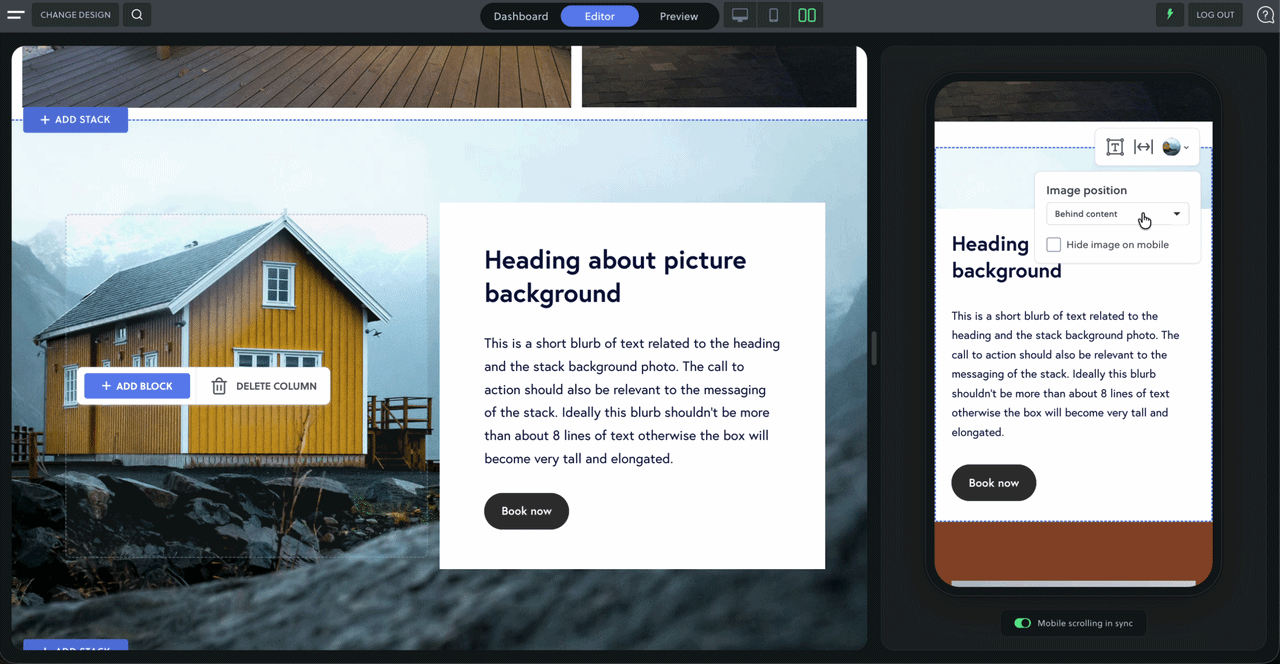
A background image can look stunning behind your content on desktop. But on a phone there often isn't the room for text to sit comfortably over it — so until now, the usual fix was to hide the image on mobile, where most of your visitors actually are.
Now there's a better option. Move any background image above or below your content on mobile in a single click — no need to hide it, and without ever touching your desktop layout. For the first time, how your images sit on mobile is a design decision, not a compromise.
See every mobile change live
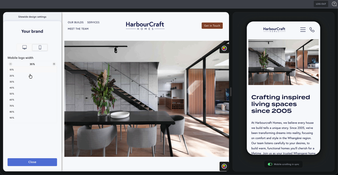
Adjusting your sitewide settings for mobile used to mean saving, reloading the page, and switching back to the mobile preview just to see what you'd done. It was one of the most frustrating parts of editing on mobile. Now it's gone. Resize your mobile logo, tweak your menu header, or change sitewide text styling and watch it update live in the preview as you work — so you can get it looking right in the moment, no saving and guessing required.
Register now for early access
Be one of the first to try the new mobile image controls. They're built to make designing for mobile feel effortless. Pair it with Side by Side and designing for mobile has never felt easier.
What's new?
Mobile image positioning — place a background image above or below your content
Blue outlines around text when adjusting mobile text styling.
Hide image on mobile, right where you're working
Live mobile preview in sitewide settings — see logo, menu changes, and text styling for mobile