Why do I need a mobile website?
Websites are usually designed to be viewed on a computer. In other words, they’re made for a big screen, keyboard and a mouse. They work great on a desktop or laptop, but when accessed on a mobile those same websites can become unwieldy: text too small to read, links hard to click, and pages too hard to navigate. The result? Frustrated customers.
That’s a big deal because recent research shows that smartphones now outnumber regular mobiles, with half of all Kiwi adults owning a smartphone (49.8%, compared with 45.2% using standard mobiles). Similarly in the UK we see increasingly that smartphones are being used for web-browsing and online shopping.
A recent study by Google showed that nearly half (48%) of users report feeling frustrated and annoyed by websites that don’t work well on a mobile. And here’s where it really hurts: a whopping 79% of users say that if they don’t like your mobile site, they’ll look for another site instead. That means lost customers and, ultimately, lost sales. Ouch.
What will my mobile site do?
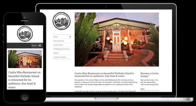
A mobile website makes navigating your site on a phone a breeze. Any time your website is accessed from a mobile, the site is automatically reorganised to ensure maximum usability and minimum frustration for your customers. The content and appearance is consistent with your full website, so it still looks like your site, but the content is shuffled around into a mobile-friendly layout, which makes for hassle-free navigation. Take, for example, the website menu.
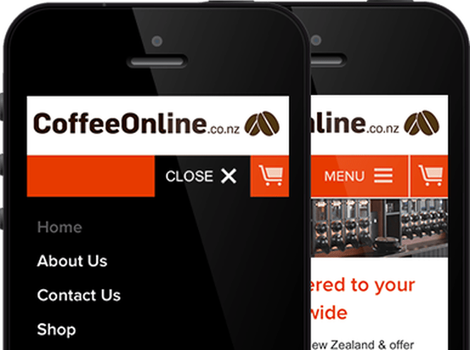
The menus on a full website are often just too fiddly for a phone, seemingly impossible to navigate successfully on a touchscreen. Using the mobile website menu, on the other hand, couldn’t be any simpler: clear and accessible, like it was made for your fingertips. Your site loads quickly too. That’s important because research suggests that 49% of mobile users will abandon a website if it takes more than 10 seconds to load. And your mobile website comes with a whole slew of handy features, like tap-to-call, which enables your customers to call you just by tapping your phone number. The whole experience feels natural and intuitive, making your website a joy to use even when navigating on-the-go.
What about sales? Google's research showed 67% of users say that if you have a mobile-friendly site, they’re more likely to buy your product, and 74% say they’re more likely to visit your website again. So having a mobile website is good for business—it’s that simple. And because a Rocketspark mobile website uses your existing content, it won’t suck up any more of your valuable time. Best of all, as a Rocketspark client your mobile optimised website comes at no additional cost. Yep, free. Your business can enjoy the benefits of being mobile-friendly without being burdened with the extra expense. Increased sales at no extra cost of time or money? That’s a no-brainer.
Now your customers can get a great website experience on any device.