Somewhere between using a 13 inch laptop screen and a 24 inch desktop monitor, a lot of good website designs start to come apart. Headings wrap in odd places, email addresses break onto a second line and the photo you carefully cropped loses half its subject.
In a recent webinar, Rocketspark’s Head of Customer Success, Carlos, and Graphic Designer, Tyron, showed where layouts tend to slip as screens change size, and the habits that stop it happening.
Every screen size covers a range of widths
Most website platforms adapt your design to around four screen sizes. Mobile covers phones, small takes in tablets, larger phones and some compact laptops, medium is where most laptops sit and large starts at 1,460 pixels and stretches all the way up to a 27 or 32-inch monitor.
The trouble is how much room sits inside each size. Medium alone runs from 1,080 to 1,460 pixels, a spread of nearly 400. If you design on a big monitor at the top of that range, anyone viewing on a smaller laptop gets a squeezed version you never saw.
Build at the bottom of each breakpoint
Carlos's go-to habit is to design at the narrowest point of a screen size. Drag your editor or browser window narrower until you see the text size step down, then widen it again just slightly. You're now looking at the smallest version of that layout, so your text and email addresses only gain room as screens get wider.
Tyron adds one trade-off to watch for. A heading you've balanced neatly over two or three lines at that narrow width can stretch into one long line on a large monitor, so check the wide end too.
No build position protects you completely, so make checking part of every build. Drag the preview from wide to narrow and back again, watching for wrapping at each step.
Use empty columns instead of big gaps
To push text to one side of a hero section, you can either add an empty column or put a large gap between columns. Both look the same on a big screen and behave very differently on a small one. Column widths scale with the screen, while fixed spacing stays the same size and eats into your text as it scales with the column as the screen narrows. In Tyron's side-by-side demo, the versions built with spacing start wrapping awkwardly, right down to the ends of words dropping onto their own line.
Know how your images will crop
A standalone picture block holds its proportions at every width. A column or stack background image fills its section, so it crops as the screen size changes. On very wide or very narrow screens, important details like people’s faces can get cut off, depending on where they sit in the image. Where the subject matters, a picture block is the safer choice. If you do use a background, adjusting the image's alignment can keep the important part in frame.
Narrow banner images need the same care. A long, thin image that looks great across a desktop gets very small on a phone, and any fine detail disappears. Check it in a mobile preview before you commit to it.
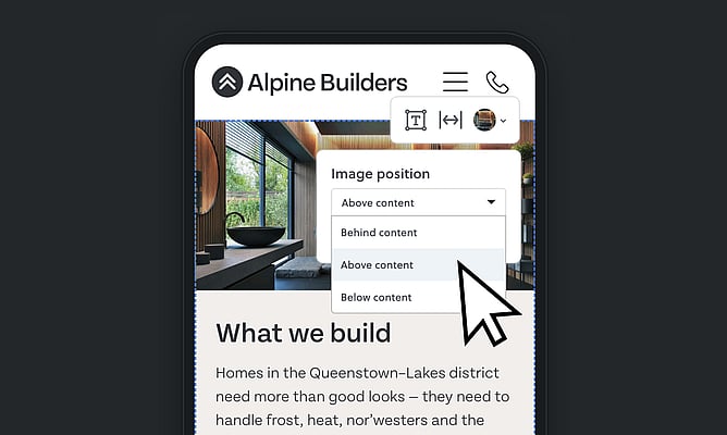
Give mobile its own layout for text over images
Text sitting in the empty space of a photo can look striking on desktop, but be hard to read on a phone. Rocketspark recently added this feature, so you can now choose whether a background image sits behind, above or below your content on mobile.
Keep menus and full-width content in check
A menu that fits on one line at full width can wrap onto two on a smaller laptop. Fewer top-level items, with the rest grouped into drop-down menus, keeps it tidy at every size.
Full-width content needs the same thinking. On a large monitor it keeps stretching towards the edges, so a heading that looked compact on your screen turns into one long, thin line. Carlos mainly uses the middle content width, and if he finds himself adding more than 150 to 200 pixels of spacing on either side, he takes that as the sign to switch.
Give every build two minutes at the edges
Before your next site goes to a client, stress test your website layout from your widest screenwidth down to your narrowest and watch the headings, the email addresses and the faces in your photos. That's where these problems show up first, and it takes far less time to fix them now than after launch.
You can watch the full webinar recording to see every example in action.
