Designer Debrief is our behind-the-screen look at how Rocketspark designers build award-winning websites. Not just the finished pixels, but the choices that help a site win awards and do its job.
This time, we're stepping into the Gold Award-winning build behind Faulkner Construction, designed by Katrina Wilson from The Brand Merchant.
Faulkner Construction came into this project with plenty going for them. A bold logo, a striking colour palette, a heart-shaped icon that captures their point of difference, and a portfolio of architectural homes and high-end renovations to back it all up. What they were after was a website that would carry all of that through to the people landing on it.
"They had a beautiful brand. They had a beautiful logo, colours," Katrina says. "The original site they had just didn't quite reflect that yet. It was sort of standard."
So the brief, in essence, was to let the brand catch up with itself online. Take a strong foundation, extend it across a full website, and make sure the finished site felt unmistakably like Faulkner.
Meet the designer: Katrina Wilson from The Brand Merchant
The Brand Merchant is a small design studio, which Katrina says is "basically me," working closely with a network of copywriters and marketers she's built up over the years.
"I specialise in branding and websites, and I love doing the branding that follows through into all the rest of the collateral," she says. "Especially going from brand to website. That's my favourite thing to do."
She's been out on her own for about six years and works mainly with small and new businesses across a wide mix of industries. Construction was new territory.
How the project came about
The job came through Jacqui, a Fractional CMO Katrina collaborates with regularly. Jacqui was already working with Faulkner, and when they decided to refresh the website, she brought Katrina in.
"It's been really helpful in all the work I've had, just people I've worked with before, copywriters I knew of," Katrina says. "After so many years, you have those contacts."
The three-way set-up, with Katrina on design, Jacqui as Fractional CMO on copy and strategy, and Faulkner as the client, shaped how the whole project ran.
The brief: a site that lived up to a great brand
Faulkner had a logo, a colour palette, and a heart icon, but not much guidance on how to use it.
"There weren't strict guidelines. Just a basic brand guide with the colours and logos," Katrina says. "So I definitely had a bit of creative licence to add to that."
The real brief was about positioning. Faulkner sits in the architectural building space, and they wanted a website that signalled that.
"They wanted a site that really showcased them as being someone different at that level of building architectural homes and renovations," Katrina says. "They wanted something bold and striking, really using the lovely brand they had, to bring that personality out."
So that became the anchor: showcase the work, lean into the brand, build something they'd be proud to send people to.
How Katrina approached the work
Extending the brand before designing the site
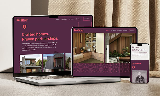
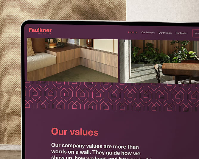
Katrina's first move wasn't to design pages. It was to take Faulkner's existing brand and figure out how to push it further. She built a pattern from their heart icon, mapped out different ways the colour stacks could work, and put together a small system of brand extensions before she touched the website itself.
"I did a bit of a brand extension, showed how those stacks could look with the colours, created the heart pattern and a few of the animations that ended up on the site," she says. "I built upon what was already there, which was a strong foundation."
That foundation came from somewhere. When Faulkner originally commissioned the brand, they'd chosen bold colours because they wanted to stand out, and the early conversations with Katrina pointed in the same direction.
"In the initial consult, I asked, what sites do you love?" she says. "They showed me examples of bold, bright colours, bigger fonts, that kind of style coming through."
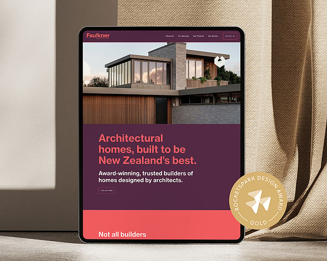
The hero video that nailed it first time
The top of the Faulkner site has a hero treatment that moves. Not a traditional video, but an animated showcase that gives the homepage a sense of motion straight away.
"The client really wanted a showcase video but they didn’t have live footage of any of the builds so this showcase was a nice compromise with the intention of maybe doing a hero video in the future. ," Katrina says.
She dodged the usual circling on briefs like that by leaning on what Faulkner already had: a stunning library of architectural photography. She built the hero around it, and the result clicked first time.
"They were really happy with it straight off the bat," she says. One and done, which is rare enough to be worth noting.
Bold type, with the content cut back
Ask Katrina what set the tone of the site and she doesn't go straight to colour. She goes to typography.
"It was the bold font, the imagery of the video, then the font on that hero. The H1s are really bold," she says. "It's not overly content heavy. The text takes precedence, so you really notice it with the colours."
This is one of the quieter decisions on the site and one of the most important. Bold colour can tip into chaos when it's fighting dense paragraphs for attention. Keeping the content tight gave the colour room to do its job.
"It took a bit to get that balance," she says. "Once I had the homepage and the stacks working together, it flowed through into the rest of the site."
The little details
The brand extension Katrina built early on did a lot of work in the final design. The heart pattern appears across stacked sections, the colour blocks have rhythm and contrast, and there are subtle motion details that reward you for paying attention.
The bit she lights up about is a Lottie animation on the heart icon.
"I really like the little animations I threw in," she says. "Just having those little extra bits, I quite enjoyed that part."
Faulkner were enthusiastic about all of it. "They love things that are pushing the boundaries or different," Katrina says. "They really wanted their pattern used. They wanted to see their brand really pushed."
Copy and photography that came ready to go
Faulkner's copy was handled by Jacqui from the start, and by the time it reached Katrina it was ready to be designed around.
"That makes it a really great process," she says. "When it comes to design, it's just all there."
What made it work was that the copywriter understood web design. "She knows web design as well, so she writes it in a way that's really relevant to websites. It's so helpful."
The photography was just as much of a head start. Faulkner had already invested in proper photographers documenting their builds, so Katrina could focus on design rather than scrambling to fill image slots.
The collaboration
Faulkner are in Auckland, Jacqui works from Tairua, and Katrina is somewhere else again. So everything ran on Google Meet from the first call onwards.
There was real back and forth, but in a productive way. Faulkner have a strong design eye themselves, which Katrina credits for catching small things she'd stopped seeing.
"They could easily say, hang on, I think we'd line that up with that," she says. "You get so into the site, they'd often see things I hadn't."
The clearest example came on the first homepage iteration. Katrina had pushed the type and colour about as far as she thought was sensible. Faulkner came back and asked for more.
"They wanted those fonts even bolder. So I was like, great, let's make it even more bold and stand out."
The project also came in on time, which Katrina credits to the consultant. "It was bang on, but very much driven by Jacqui's work as Fractional CMO. We had a goal and we got there."
What she's most proud of
Asked what she's most proud of, Katrina starts with the hero and ends up at the whole site.
"The hero banner, I was really happy with. I did kind of go, how am I going to make this work," she says. "It took a while. And I really like the little animations I threw in. But as a whole, I was really happy with how it came out.
Katrina's advice for other designers
Her takeaway is for designers who think websites aren't for them. She's been that designer.
"My younger self, I'd tell her to give that extra stuff a go," she says. "Learning a whole new platform, pushing through the things you think aren't for you. I can do it, and I actually really enjoy it now. It's almost what I prefer above anything else."
The advice cuts wider than just websites. Katrina is also clear about what she doesn't do well, and she doesn't apologise for it. SEO, analytics, the numbers side. She brings in people who love that stuff.
"You have to work with people whose strengths are those things, because I'm very aware of what isn't my strength," she says. "I'd much rather give it to someone who enjoys that, thrives on that."
That's not a contradiction with the "don't limit yourself" advice. It's the other side of the same idea. Push yourself where you have room to grow creatively. Bring in good people where you don't.
"In terms of design, push yourself," she says. "You don't know what you can create if you don't try."
Why Rocketspark
The decision is simple (so is the software).
"I can design something neat, teach them (my clients) how to use it, and they can edit it. That's the biggest thing," she says. "On other platforms, they struggle to remember how to get in, can't change anything. That makes it an easy sell, and it makes it easier for me to hand over."
You can see more of Katrina's work at The Brand Merchant, where she's promising herself (and us) she'll be a bit louder on Instagram by the end of the year.
Are you a Rocketspark designer with a project you'd love to share? We'd love to hear from you.