You know that feeling when you've spent ages getting the desktop version of a homepage just right, and then you flip over to mobile and have to start tweaking it all over again? Resizing text, adjusting spacing, nudging things until the phone version feels as good as the desktop one. Yeah, we've been thinking about that one.
Designing for mobile has always felt like a second pass. You build the website on desktop, then go and "fix" it on mobile, which is essentially twice the work for one website.
That changes today.
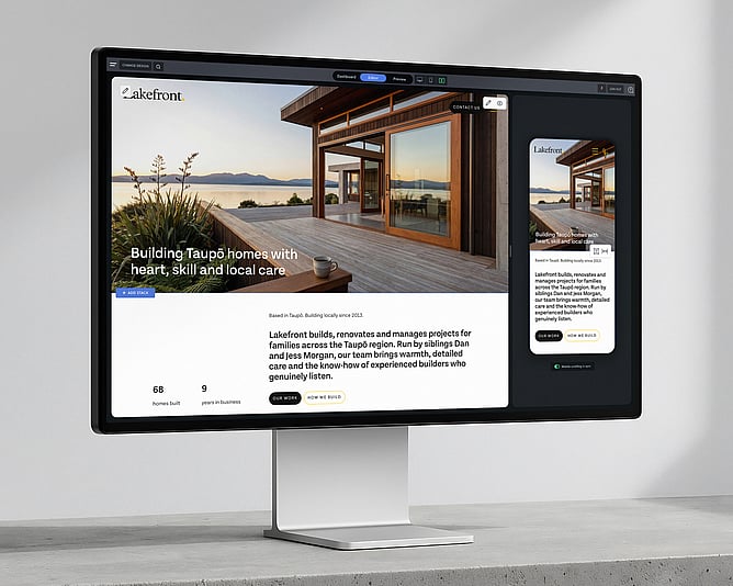
Meet Side by Side, a fresh new way to design in Rocketspark. Your computer view and your mobile view sit right next to each other in the editor, both updating live as you work. One workflow, both screens, no more flipping back and forth.
Desktop and mobile, right next to each other
Your computer view sits on the left, your mobile view on the right, and both update as you work.
Edit text and instantly see how it displays on the phone view. Drop in a picture and see how it sits on both screens straight away. Got a long page with lots of sections? You'll spot any spacing problems, the awkward line breaks, the pictures that don't quite work on a phone, the moment they happen. Not three clicks later in some separate preview.
Scrolling is synced across both views. If you scroll your computer down to the third section on your page, the phone scrolls with you and shows you the same part of the page. Always showing exactly what you're working on.
It's one of those "where have you been all my life" features.
Mobile editing without the sidebar treasure hunt
Tweaking the mobile version of your website used to be a journey. Spot something to change, open the sidebar, hunt for the right setting, switch to the mobile tab, make the change, scroll back to where you were. Rinse and repeat, 20 times a page.
Now? Hover over a section on mobile and the controls you actually use, things like text size and spacing, pop up right there on top of the section you're editing. One click and you're moving on.
Multiply that across every section, every page, every project, and it adds up to hours back in your week.
Designing on a giant monitor? Most of your visitors aren't
Here's a question we get from designers all the time: "What screen width should I design for?"
If you're working on a 27-inch monitor, that's the screen width you're naturally designing for. The trouble is, your visitors probably aren't. The most common desktop resolutions are still 1920×1080 and 1366×768, with plenty of laptops sitting somewhere in between. A site that looks great on a big external monitor can look stretched, oddly spaced, or just a touch off on a smaller laptop screen.
That's where Side by Side quietly does you a favour. The desktop view in the editor is set at a real-world width from the start, so you're designing where most of your visitors are looking from day one. No more redoing a polished design when you realise it doesn't quite hold up on a 13-inch laptop. Best practice, baked in.
Test your design at any desktop width
Here's a little touch to make life even easier. See that vertical line sitting on the right edge of the desktop view? That's a width handle. Click and drag it inwards, and the desktop view shrinks. Let go, and it stays put. Drag it back out, and it grows again.
It's the easiest way to check how your design holds up as your visitors' screen widths change. A 13-inch laptop. A smaller external monitor. You can scrub through every realistic width without ever leaving the editor, and spot anything that needs a tweak before your visitors find it.
For designers, this is the cleanest way to build a website that looks polished on every desktop, not just the one you happen to be sitting at.
Designers, you're going to love this one
If you build websites for a living, you already know exactly why this is going to feel good.
You've had your phone propped up next to your laptop, refreshing it constantly to check what's actually happening on mobile. You've spent late afternoons hand-tuning the phone version of every project. You've delivered websites you're proud of on desktop and quietly worried about how they'd look in someone's hand on the bus.
Side by Side puts an end to all of that. Less repetitive work, and more confidence that what you see in the editor is exactly what your clients will see on their phones.
For partners working on long, content-rich websites, the kind with lots of sections, lots of detail, lots of moving parts, this is the sort of feature that changes the way you build.
"Wait, you can edit the mobile version?"
Here's something that surprised us along the way.
Plenty of people building their own Rocketspark website didn't realise they could edit the mobile version at all. They thought the little phone icon was just a preview, just a peek at what visitors would see.
With Side by Side, mobile is no longer a hidden mode you have to go looking for. It's just there, sitting next to your computer view, all the time. You'll start polishing how your website looks on a phone without even consciously deciding to. No more "how does this look on a phone?" surprises.
More confidence, every time you build
There's a quiet kind of stress that comes with not knowing how something looks until you check.
You build a beautiful homepage on your computer, but you're not really sure what it's doing on a phone until you open it on your own phone, or worse, until a client opens it on theirs. That little gap between "looks great in the editor" and "looks great in the real world" is where so much of the back-and-forth in a website project lives.
Side by Side closes that gap. You can see, in real time, how your work is landing on both screens. It's the kind of thing that makes you bolder. Try a new layout. Push the typography. Build the longer, more detailed page you were talking yourself out of. You'll know how it lands before anyone else sees it.
More mobile goodness on the way
Side by Side is just the start of where mobile design in Rocketspark is heading. There's more to come, and we'll share each new piece as it lands, on the blog and in your inbox.
We're rolling Side by Side out gradually, so we can keep a close eye on the experience and make sure it lands beautifully for everyone. If you jump into your editor and don't see it yet, hang tight, it's on its way to you. If you'd like access a bit sooner, flick our team a quick email at support@rocketspark.com, and we'll get you sorted.
Got ideas for what would make the mobile experience even better? We're all ears, and we love hearing from you.