Designer Debrief is our behind-the-screen look at how Rocketspark designers build award-winning websites. Not just the finished pixels, but the choices that help a site win awards and do its job.
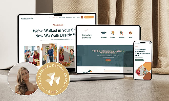
This time, we're stepping into the Gold Award-winning build behind Astute Education, designed by Leah from Ladeda.
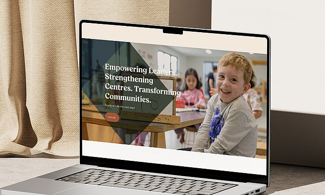
Early childhood education runs on trust, warmth and relationships. But the language around it often sounds like the opposite: due diligence, governance, feasibility, compliance. When Astute Education came to Leah, their website was full of those words. It worked, technically. But it didn't feel like the business behind it.
"Their website didn't reflect just how good they were, the kind of stuff that they were doing and how impactful they were," Leah says. "It was really dated."
The job was to take a business that people already knew and respected, and give it a digital presence that actually matched.
Meet the designer: Leah from Ladeda
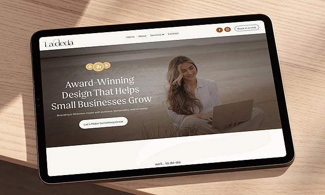
Leah runs Ladeda, a Waikato-based design studio specialising in branding and website design. She works mainly with professional services businesses, but her client list spans retail and beyond.
"Really anybody who wants to collaborate on a project and who is passionate about their business," she says. "That's who I want to work with."
She builds exclusively on Rocketspark, and she takes on both brand and web design together whenever she can. That preference shaped how this whole project came together.
How the project started
Jo, one of Astute Education's co-owners, reached out to Leah directly after seeing her work elsewhere. What caught Jo's attention was the warmth in Leah's designs.
"She really wanted a lot of warmth and everything brought into the website," Leah says. "She just reached out to me. It was great."
Jo mentioned she was open to a brand refresh. Leah suggested they start there, and the answer was immediate.
"It was my suggestion, but it was almost led by her in a way," Leah says. "It was really easy to be like, yeah, we should do this. Jo and her business partner Gavin were clear on what they wanted, organised in how they worked, and open to being guided. For Leah, that kind of client makes everything easier.
"They had a clear understanding of how they wanted to come into it, which isn't always the case with my clients," she says. Whereas these guys had a really clear direction and goal."
The brief: a new hub, a new voice, the same reputation
Astute Education was already well established and well known in the early childhood education space. But the website had fallen behind the business.
The immediate trigger was practical: they needed a membership portal where people could access courses, resources and information in one place, without the team having to share everything manually. But the goals ran deeper than that. The existing site still listed services they no longer offered. The language felt heavy and corporate. The brand, while recognisable, wasn't giving them enough to work with.
"We really wanted to adapt it so that it reflected what they do, who they are and how they actually help their visitors," Leah says.
The constraint wasn't budget or content or photography. It was time.
Jo and Gavin are busy people running a growing business across multiple locations (Auckland and Hamilton, plus other commitments). Getting everyone together for feedback was the logistical puzzle that kept recurring throughout the build.
"I feel like the more successful the business is, the harder it is to nail down whoever is in charge of the build," Leah says. "If you're trying to talk to the CEO or whoever's the managing director, yeah, time can be the hardest part."
How Leah approached the work
A brand refresh that honoured what came before
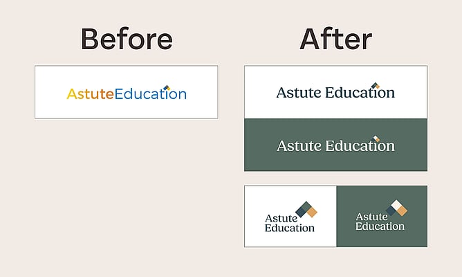
Astute Education had an existing brand with history behind it. People already knew them. So Leah didn't start from scratch. She treated it as a revamp, keeping the bones while shifting the feeling.
"We wanted to pay respect to the existing brand," she says. "It still has a similar look and feel. Well, it doesn't, it has a whole new beautiful look and feel. But the base is there."
The big shift was warmth. The palette got warmer and more inviting, and the identity expanded beyond just a logo into a proper system: colour palette, fonts, custom illustrations, and brand elements that could carry through every touchpoint.
Custom illustrations that bring in the playfulness
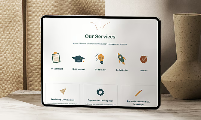
The early childhood education space is ultimately about children. But the brand itself was clean and geometric, which could easily tip toward feeling corporate. Leah used custom illustrations to change that.
"We are at the end of the day dealing with kids. They're the ones that are going to benefit from this business," she says. "So I wanted to bring in that fun element, that approachable element, that friendly element and playfulness."
The illustrations sit alongside the clean typography and warm palette as a counterbalance, stopping the site from feeling too serious while keeping it professional. And because Leah built the brand herself, she could design illustrations that felt native to the system rather than bolted on.
Animated text that nailed it first time
One of the most distinctive touches on the site is the animated rotating text on the homepage. The words "Be Astute, Be Bold, Be Brilliant" cycle through, setting the tone before the visitor scrolls.
This came from a genuine collaboration. Jo and Gavin sent through reference sites they liked, and one featured scrolling text. Leah grabbed the idea and ran with it.
"It worked so well to just have the brilliant and the bold and stuff like that be rotated through," she says. "It was a bit of a joint effort."
"Sometimes you're like, it just worked so well, this is meant to be," she says. "I was even looking back at my interactions with them and I was saying, this is the homepage, how's it look? And it's exactly how it is now.”
Weaving the brand through the website
The Astute Education logo features diamond shapes, and she pulled those geometric elements through the entire site: into feature areas, layered over imagery, used across pages as recurring visual cues.
When asked whether she always tries to weave brand elements into the web design, her answer was pointed.
"What is the point of difference from you and every other person if it's not weaving in your branding?"
— Leah, Ladeda
"What is the point of difference from you and every other person if it's not weaving in your branding?" she says. "If you're not bringing in parts of your branding throughout the website, why does it not look like everybody else's? It makes them generic."
Not every brand has elements that translate this cleanly into a website. But because Leah built both the brand and the site, the visual language was designed to travel. The diamond shapes weren't retrofitted into the layout. They were always meant to be there.
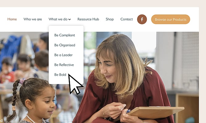
Simplifying the structure by adding more
The previous website was cluttered with industry terminology. Visitors had to wade through pages about due diligence, governance and feasibility to find what they actually needed. Leah restructured the navigation around a new framework: Be Bold, Be Reflective, Be Organised.
"We were bringing in this new structure which I think is super impactful," she says. "It's much easier for these people to find what they want."
The detailed content still exists, accessible through secondary navigation at the bottom of the site. But the primary experience is cleaner and more intuitive. The services got clearer, friendlier labels and a more logical hierarchy, so the site feels less overwhelming even though it actually contains more.
"Their previous website was a bit trickier to find what you wanted to find," she says. "It was simplifying it by making it more user-friendly and the navigation easier."
Copy, content, and the "working backwards" approach
For this project, Jo and Gavin handled the copywriting themselves. Leah adapted it for the design and for SEO, but the substance came from the clients.
What she particularly loved were the small, human touches they brought: quotes at the bottom of pages, te reo Māori phrases woven through the content. She pulled those into more pages than originally planned.
"It's such a human element that I loved," she says. "It's that caring side of it that they have."
This project was the easy version. Leah talked candidly about what happens when it's harder. When clients freeze at a blank page, she works backwards: building out the design with placeholder structure and asking clients to fill specific slots.
"I kind of build out some more generic content for them," she says. "And then I say, look, this is what I want the design to look like. So you tell me what's going to go here."
It's a useful move for any designer who's stuck waiting on website copy. Give the client a shape to react to, rather than an empty space to fill.
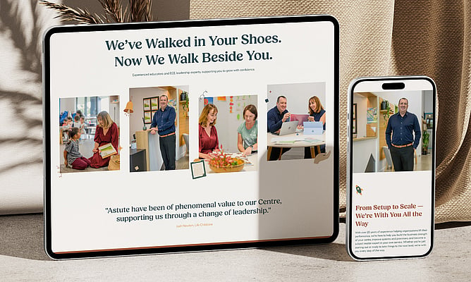
Photography that was already thinking about the brand
Leah suggested Astute Education get new photography for the site. The clients handled the shoot themselves, and the photographer came back with images that already considered the brand's warm palette.
"When I got these back it was like, oh, they had thought about how the colours work together and the rich tones," Leah says.
She's quick to add that colour coordination in photography is about feel, not matching everything exactly.
"You don't want it to be too literal," she says. "But having little pops of the brand or just being considerate of the look and feel, what the lighting's like, that makes the biggest impact."
The collaboration
Jo and Gavin were hands-on throughout, even though distance made it harder. With the co-owners in different cities, everything happened through online meetings. Leah would send Loom video walkthroughs ahead of time so the clients could review in their own time, make notes, and come to meetings ready with focused feedback.
"I give them time to come up with their thinking, their feedback, and then not put them on the spot," Leah says. "We can come together and have a real productive meeting."
The co-owners were also aligned in their decisions, which kept things moving.
What she's most proud of
Leah's answer here is about the transformation.
"It really is probably the feel from the website going from the existing website to how this one looks," she says. "I think it shows who they are and what they do so much better."
Then she lands it simply.
"It just is them on a website, which is what you want."
Leah's advice for other designers
Leah's lesson from this project is about confidence. Specifically, the confidence to make suggestions that push a project further, even when it might feel like overstepping.
"If you have a suggestion that will make their business work better for them, their brand work better for them, their website work better for them, then let them know," she says. "They're hiring you to be the expert."
She acknowledges it takes courage. Designers sometimes hold back because they worry about scope, or about suggesting something that will cost the client more.
"Sometimes people feel like they're going to make assumptions about, now that's going to cost them more because they need a brand refresh," she says. "But in the long run, if it's going to be beneficial to their business and you're providing the extra value, that is actually what gets the repeat business."
"You're not in your business by mistake," she says.