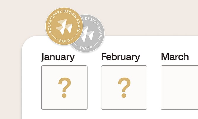
January and February came and went without a Rocketspark Design Award. No Silver, no Gold. We'd rather talk about why than leave you wondering.
"Most years we see more awards in Rocketspark's seasonally larger months. January and February are often lower as many of our designers slow down their businesses while their children are off school for the holidays. That said though, to win an award in a quieter month means you don't have to share the exposure with other award winners, so it's a good time to try and get an award." — Jeremy, Co-Founder
January and February have been our quietest months for five years running. Many of our best partners slow down their businesses over the summer holidays while their kids are off school. Stepping away from client work for six weeks is a real commitment when you're running your own studio. It means pausing your pipeline, your cashflow, and your business growth. The fact that so many of our partners have built businesses with the independence to make that choice is something we admire ♥️ But it does mean a smaller pool of sites entering judging.
With a smaller pool, it would be tempting to relax the scoring just so we'd have an award to celebrate in the newsletter. We've chosen not to do that. We actually used to run a "site of the month" award, and quality varied hugely between busy and quiet months. Moving to Gold and Silver with fixed scoring criteria was how we solved that. Gold is Gold. It's hard earned, and we don't want to water down what it means for the designers who've earned one.
"Starting out on my own, I've had to be my own cheerleader a lot of the time, so to have Rocketspark backing me up and recognising my work meant the world. This is what I do. Rocketspark websites are my thing, so winning an award for one of them feels like the highest praise I could get." — Leah, Ladeda, Multiple Gold Award Winner
That's why we protect the standard. So with a smaller pool and the same criteria, no site crossed the line this time. But they came close.
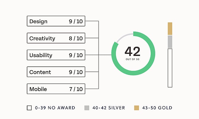
Every site was within 3 points of Silver
Every single site across both months scored between 37 and 39 out of 50. Silver starts at 40. Gold starts at 43. We're talking about a few points, and we can see exactly where they'd come from.
The scoring criteria hasn't changed. We haven't raised the bar or tightened our approach. We went back through the January and February scorecards together and looked at where those last few points were sitting. Here's what we noticed, and what the designers who've already won Gold say about the same things.
How the scoring works (a quick refresher)
Every partner website that's upgraded or launched during the month is automatically entered into judging. We review each site independently against five categories: Design, Creativity, Usability, Content, and Mobile, each worth up to 10 points, for a maximum of 50.
Silver = 40-42 points. Gold = 43 or above.
The sites in January and February were scoring mostly 7s and 8s in each category. Solid work. But to get into Silver and Gold territory, you need to be landing 8s and 9s. That means sweating the details across the whole site, not just the homepage.
We also want to say clearly: we have no favourites. The scorecard exists so personal preference stays out of it.
First impressions: the most important screen on your site
Creativity is where first impressions live, and across this round it was the category with the most room to move. The scores here weren't low. Most sites were landing 7s and 8s. But to get into Silver and Gold territory you need 8s and 9s, and the difference between those numbers often comes down to a few deliberate choices on that very first screen.
When someone lands on a website for the first time, something should catch them. It doesn't have to be loud or complicated. It just has to be intentional. Every element on that first screen should be earning its place.
Here are the patterns we kept seeing:
Text overlaid on dark hero images. When white or light text sits over a dark, busy photograph, both suffer. The image loses its impact and the message becomes hard to read. The fix is often simple: separate the headline from the image rather than layering them. Let the image breathe, and let the headline land cleanly above or below it.
Too many elements competing above the fold. Some sites added extra design elements at the top of the page that pulled attention away from the hero rather than adding to it. Everything above the fold should be working toward one thing: a strong first impression. If something isn't contributing to that, it's working against it.
The homepage not feeling like a homepage. A handful of sites felt more like a landing page or a menu page when you first arrived: lots of navigation options, but no real sense of arrival. Within the first few seconds, a visitor should know where they are, what this business does, and what kind of experience they're in for. If that orientation isn't immediate, the visitor's attention is already drifting.
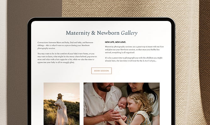
Hero images cropped so that key elements are lost. A hero image that crops out a person's face, the key product, or the natural focal point of the scene loses the emotional connection that makes a first impression work. This came up more than once. It's worth doing a careful final check on every hero image before launch, across both desktop and mobile.
The sites that score 9s in Creativity make a clear visual statement from the moment the page loads. There's a mood. A deliberate point of view. Someone made a specific creative choice rather than reaching for the nearest safe option.
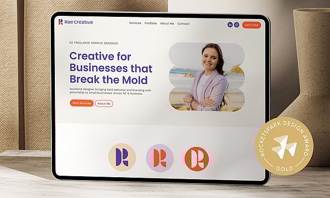
Laykanne from Rae Creative was deliberate about this on her own studio site, which won Gold. She noticed a lot of designers gravitating toward the same soft, muted palettes and chose to go the other way completely:
"It's going to stop you in your tracks. It's going to get your attention. You're going to be like, okay, what is this? And that's exactly what I wanted."
Photography: where real points are won and lost
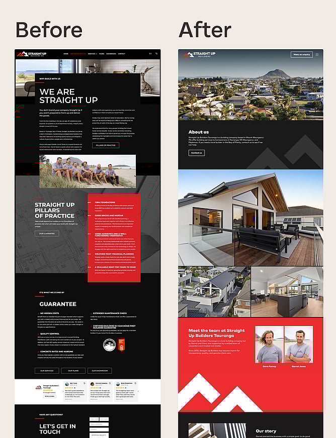
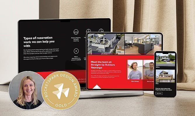
Lizzy Webb from LW Creative dealt with exactly this challenge on the Straight Up Builders site. The hero image wasn't going to crop well across different screen sizes, so she fixed it before it became a problem:
"That homepage image was cropped in too tight, so it's had its background extended with AI. If I would have used the original image, it wouldn't have been positioned well, and parts of the home wouldn't be seen on mobile."
That's the kind of catch that separates a 7 from a 9 in Content.
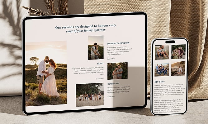
Professional photography keeps coming up as one of the clearest differentiators between sites that win awards and sites that don't. It shows up across both Creativity and Content. The sites that score highest have imagery that feels chosen specifically for this brand, this audience, and this site. The photography has quality, purpose, and authenticity. The sites that score lower often have either generic stock photography (the overly polished, people-high-fiving-in-an-office variety) or DIY photos that, despite being genuine, don't have the technical quality to hold up at scale.
If a client can't afford a full professional shoot, there's still a lot you can do: curate better-quality stock that feels natural, extend or adjust images using AI tools when the crop doesn't work across devices, or plan ahead for better photography on the next project.
Copy: treat it like a design problem, not a client problem
Content scoring lives and dies on the quality of the copy. Thoughtful, well-written copy elevates a site. Generic, padding-heavy copy drags it down, even when the design itself is strong.
It's easy to treat copy as the client's responsibility. But the designers who consistently win awards get involved with the words. They push for clearer, more specific language. They help the client find a copywriter if needed, or they refine what's been supplied rather than just laying it out as-is.
Lizzy rewrote the entire copy for Straight Up Builders herself. Not because the client couldn't write, but because she understood what the site needed to communicate:
"We want unique content because we don't want it to be detected as AI. Because we didn't want to lose any of the traditional SEO goodness… I scraped the site for all the keywords and phrases and integrated those into core pages of the site."
Read Lizzy's full Designer Debrief →
Liora from The Little Acre made a point worth sitting with: the copy doesn't just sit inside the design. It shapes it.
"If you are going to write really long website pages versus really short, that really changes the design. I like to work with what I'm given to best suit that rather than what I think is best."
Getting involved with content early, before you've committed to a layout, means the words and the design can work together rather than fighting each other.
Branding: when you've shaped it, it shows
We don't judge the quality of a client's logo. That's outside our scope and it wouldn't be fair. But we do notice the difference between a site where the designer has shaped the visual identity and one where they've worked with whatever the client already had.
When a designer has been involved in the colour palette, the typography system, and the overall brand language, there's a cohesion across the site that you can feel. On-brand typography and custom illustrations or icons are two of the things that most reliably lift a site in our Creativity scoring. They signal that someone has thought carefully about this specific brand, not just applied a template.
Lizzy described this when talking about trade clients in New Zealand:
"It's classic Kiwi and can be typical for many builders. They tend to limit their visual identity to black and white, which can make it more challenging to differentiate. We went bigger on the percentage of red than they were originally wanting."
The whole site matters, not just the homepage
We judge the entire website. Something we noticed in January and February was strong homepages followed by thinner interior pages (services, about, contact) that felt like they'd had less time and attention.
When a visitor moves from a polished homepage into a page that feels sparse or rushed, the trust starts to slip. Every page needs enough depth, structure, and visual consideration to feel like it belongs to the same site.
Liora actually pointed to an interior page when we asked what she was most proud of on the Caroline Doyle Photography site:
"My favourite page is actually her about page, not even the homepage."
That's the standard worth aiming for.
Don't forget the footer, either. Several sites had footers that felt underdeveloped. A well-considered footer is one of the most underrated parts of a website. It's where people go to find contact details, navigate to key sections, or take the next step. A strong footer makes the site feel complete.
Mobile: design for it first, not last
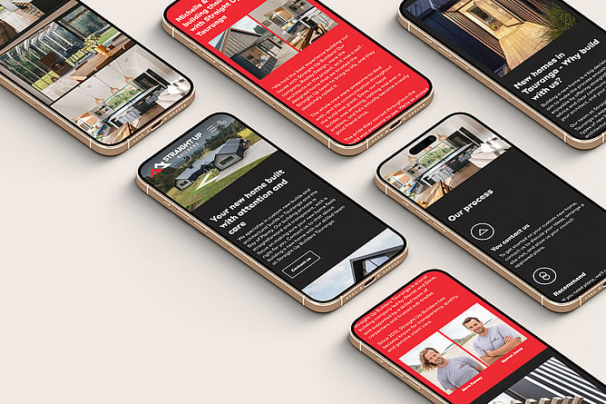
Mobile scored well across most submissions, which is encouraging. But it's worth treating mobile as a primary experience rather than a desktop afterthought, because close to half of your client's traffic is likely coming from a phone.
The standard we're looking for: does it feel as considered and intentional on mobile as it does on desktop? That means the hero still lands, the text is readable at default size, images are cropping well on a small screen, and the column order makes sense for someone holding their phone.
Lizzy flips the typical workflow completely. She designs for mobile first, and adapts to desktop from there:
"It's always mobile first, and you're making sure those images are positioned right."
Read Lizzy's full Designer Debrief →
Building with mobile as the starting point means every decision (image selection, copy length, spacing, layout) has been made with a small screen in mind.
What's next
There are talented designers in this community, and several of the people who submitted in January and February have Gold awards to their name. Every site was within touching distance. As the year picks up and more sites come through, we're expecting a strong run.
If you haven't already, check out our Designer Debrief series, where we interview designers who have won a Gold Rocketspark Design Award and talk through their process, the challenges they faced, and how they tackle websites from start to finish.
Want to read the full judging criteria? Here's exactly how we judge the Rocketspark Design Awards →