Designer Debrief is our behind-the-screen look at how Rocketspark designers build award-winning websites. Not just the finished pixels, but the choices that help a site win awards and do its job.
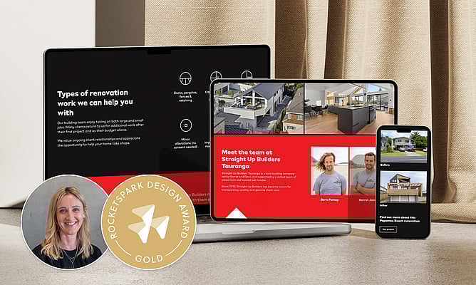
This time, we're stepping into the Gold award winning build behind Straight Up Builders, designed by Lizzy Webb of LW Creative.
"They actually renovated my house."
Lizzy wasn't meeting Straight Up Builders through a referral or a discovery call. She already knew what it was like to be their client, the kind of knowledge you only get when you're in the middle of decisions, timelines, and the reality of living through a build. She'd also seen what happened once the job was finished.
"We weren't handed-off once the job was complete. They're still there to help us."
That was the feeling Lizzy wanted the website to carry. Not hype, not glossy language, and not a version of the business that felt like it belonged to someone else. Just a site that reflects how Straight Up Builders actually show up for people.
Meet the designer: Lizzy Webb from LW Creative
Lizzy has been doing this since 2007. She started as a logo designer, and over time the work widened into a connected system: brand, digital, rollout, and print.
"I'd describe myself as a brand and digital specialist, really."
She loves working with small to medium-sized service-based businesses, especially those who've been operating long enough to know who they're there for.
"Probably three to five years or more. The reason for that is they’ve already got a good idea of who their target market is"
That track record changes the work. You're no longer guessing at who the business might serve. You can get specific quickly, make decisions with more confidence, and build a site that attracts the right clients instead of trying to please everyone.
The brief: keep what worked, fix what didn't
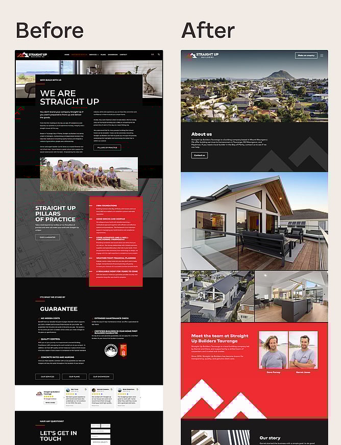
Straight Up Builders weren't starting from scratch online. Their previous website was performing strongly in traditional search.
"They had an SEO person contact them online to write their site, and along with work by other specialists later on, did a good job of getting them to number one for Builders Tauranga in traditional search."
But the copy didn't feel like them. The tone created distance rather than connection.
"They felt that it didn’t align with who they were, and it wasn’t the way they wanted to be presented online."
So the project wasn't simply a visual refresh. It was a careful, staged rebuild with real constraints: change the experience and the voice, without damaging the visibility they'd already earned, and do it in a way that's achievable for a growing trades business.
How Lizzy approached the work
Rather than treating the website as a standalone object, Lizzy treated the project as a full rollout, where each decision supports the next. The website is the centrepiece, but the brand still has to hold together everywhere else people check, especially in a category like building where referrals, reputation, and proof do a lot of the heavy lifting.
Direction first, then design
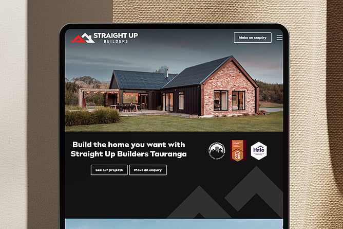
Lizzy doesn't start with a homepage layout. She starts by clarifying what the business needs the site to achieve. For Straight Up Builders, the proof points weren't abstract. The site needed to communicate competence, reliability, and care, and it needed to do it in a way that felt true to the business behind it.
It also had to maintain performance in traditional search, make space for AI-driven discovery, and feel grounded enough that a visitor could trust it quickly. That combination is what makes this a real designer's project rather than a tidy redesign. You're improving something that already works in one dimension, while fixing what's not working in another.
Align the brand so it behaves consistently
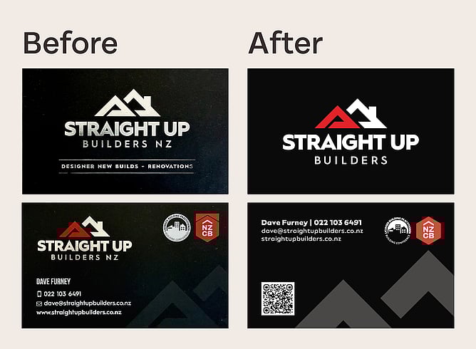
Straight Up Builders already had a logo. Lizzy adjusted it so it worked cleanly across formats and smaller placements, then tightened the wider identity so the brand could show up consistently across web, print, and social.
She also pointed to a very familiar pattern in New Zealand trades branding.
"It’s classic Kiwi and can be typical for many builders. They tend to limit their visual identity to black and white, which can make it more challenging to differentiate."
Straight Up Builders already had red in their logo, but most of the brand presence leaned heavily black-and-white. Lizzy encouraged a bolder use of red across the system.
"We went bigger on the percentage of red than they were originally wanting."
It's a practical decision as much as an aesthetic one. A consistent accent colour becomes a recognisable cue across pages and assets, and it gives the brand a signature without needing to add more design noise.
Rewrite the copy without losing what search already liked
Lizzy rewrote the site. She wanted the content to read as specific and human.
"We want unique content because we don't want it to be detected as AI."
At the same time, she wanted to protect the search equity built into the old site. Rather than discarding the previous content entirely, she pulled out the keywords and phrases that were already performing, evaluated what was useful, and integrated what mattered into the new writing.
"Because we didn't want to lose any of the traditional SEO goodness... I scraped the site for all the keywords and phrases and integrated those into core pages of the site."
The business needed a new voice, but it also needed continuity, so the rewrite had to be both fresh and careful.
Build the structure, then refine
Lizzy starts with planning in the simplest form.
"Good old pen and paper, then creating a basic wireframe structure in illustrator to make sure the pages look balanced"
Then she moves into Rocketspark and blocks out the layout.
"I grey box the site out. Using grey placeholders for images and lorem ipsum for headings and paragraph placeholder text."
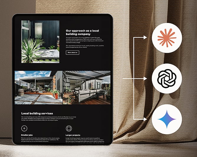
She designs mobile-first, which influences everything from image placement to how copy breaks up across sections.
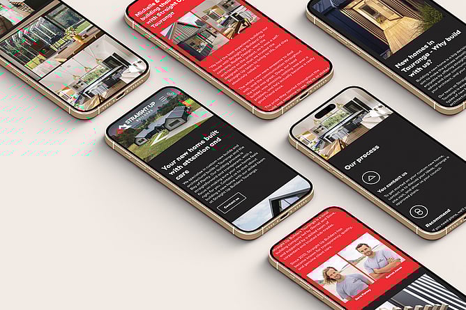
"It's always mobile first, and you're making sure those images are positioned right."
Make the imagery work
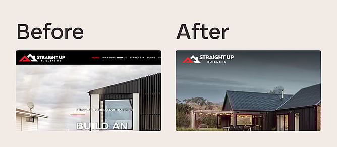
Trades websites rely on project imagery, but images aren't always captured with responsive layout in mind. Lizzy shared a specific example from the homepage hero.
"That homepage image was cropped in too tight, so it’s had its background extended with AI”
"If I would have used the original image, it wouldn’t have been positioned well, and parts of the home wouldn’t be seen on mobile"
She extended the background in Photoshop to give the hero room to breathe across devices, corrected distracting aspects if needed, and worked within the reality that not every older project had photography at the standard you'd ideally want. Better capture is planned for future work.
Showing up where people are actually looking
This is where the project gets particularly interesting. Lizzy talked about how search has shifted.
"Everything's changed in 2026. I rarely use traditional search anymore unless it’s to verify the source content and make sure it’s trustworthy. Showing up in AI search is an essential touchpoint."
Her baseline check told a clear story: Straight Up Builders weren't appearing in AI-driven results unless someone searched for the business name directly. So the findability work went beyond what was written on pages and how those pages looked. It included technical SEO and AI visibility (AIO), plus consistency work across key surfaces like social bios and business details, so the business appears coherent wherever people and systems cross-check it.
"You're posting on social media now to create those signals, those heartbeats, to make sure: 'Hey, my business is still alive. Please cite me or mention me, because I also have everything else on point.’ ”
The connection between all the earlier decisions and this outcome is worth drawing out. The brand alignment, the authentic copy, the structured layout, the mobile-first approach: these aren't just design choices. They're the foundation that makes a business legible to both humans and AI systems. When everything is consistent and clearly expressed, search engines (traditional and AI-powered) have more confidence in citing the business.
Rolling it out beyond the website
The identity work didn't stop at website launch. Lizzy carried it through into offline and day-to-day assets, including a brochure and business cards, so the brand holds together wherever someone encounters it, whether that's through a recommendation, a search result, or a piece of print handed over after a conversation.
What changed after launch
"It's understandable when people come to me, they're investing a certain amount, and it might seem like a lot, and they kind of think, 'Is it worth it?'"
Then the site has time to do its job.
Lizzy tracked performance from October 2025 to February 2026 (2 months post launch). Across 10 monitored AI queries, the AI visibility for Straight Up Builders increased from 0% to 60%, and were cited first in 40% of those key queries. For traditional search, Lizzy monitored 20 keywords and phrases and saw the average page rank position improve by 49.7% from pre-launch to two months post-launch.
The leads changed too. Lizzy shared that Straight Up Builders feel proud of their website and say it represents them well. She reported a significant improvement in both the number and quality of leads, along with many positive comments from new and past clients.
"And when they see it further down the track and they're like, '...that was amazing. Yes, this is working for us.'"
Lizzy's advice, in one line
"Just do good work for good people that genuinely care about those they serve."