There’s no doubt that website about us pages are important but what are the tricks of the trade to make sure you’ve got an about us page that gets results?
Getting your about us page content ready
In our guide to laying out an effective homepage we talk about getting all your content ready before you start considering a page layout. That approach works well for any page of a website. So let’s start by working out which content we want on our homepage and some of these things are explained in more detail in our post about the importance of an about us page:
About us page text
What goods or services does your business provide? Explain what your core business is using plain English and make it engaging. If you’ve been in business a long time, that can build trust and might be worth mentioning.
About us page images
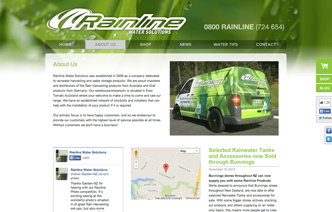
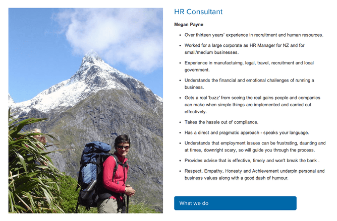
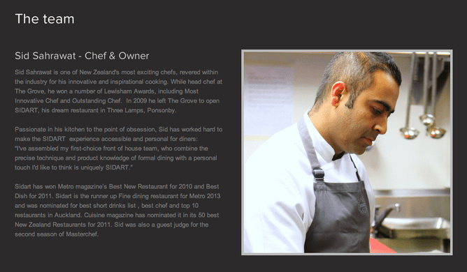
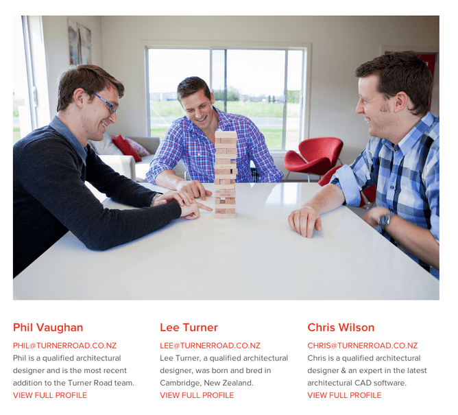
Have images that build trust, ideally of company people. Play to your assets like showing your whole team, sign writing on vehicles, building signage etc. Show that you’re a legitimate business.
About us page call to action
Calls to action shouldn’t just be limited to the home page. They actually become more important the deeper into your website someone delves as they’re more likely to make contact with you the more they know about your company. Do you want to link someone to another page of your website after viewing the about us page or to make contact with you straight away by phone or an enquiry form?
About us page big heading
Every web page should have what’s called an H1. We call this the big heading block at Rocketspark so it’s less techy sounding. The big heading block serves two purposes:
It’s important for website visitors to very quickly learn what a page is about. In ideally no more than 1-2 lines of text, you should give a summary about the content on that page. The more engaging this is written, the more likely someone will read the other content on the page.
Google love good H1’s. If you can weave important keywords relevant to the page into the H1 that can help you with your Google ranking. It’s important to only have one H1/big heading per page as Google doesn’t like this.
Laying out your about us page
Once you’ve got your content prepped and ready, there’s no hard and fast rules for the best layout but here’s a few tricks web designers use to set the hierarchy of importance on a page. Ultimately some content is more important than other content so the page should be laid out to give sequential focus and attention from most important content to least important (in much the same way as a newspaper puts the most important articles at the top half of the front page and gradually less important articles further down the page).
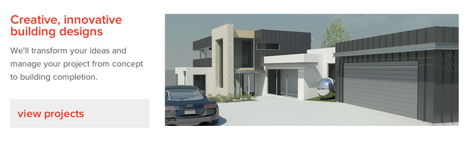
Make it visually interesting by putting good quality images near the top of the page
Whether you use a slideshow, a single large image or a small profile pic of yourself, make sure there is something visual on the page near the top of the page. An about us page with nothing visual is a fast way to send people away from your website bored. Make sure the images are of a high quality. Blurry images taken on a phone in bad lighting could have a detrimental effect. Good quality commercial photography isn’t as expensive as you might think.
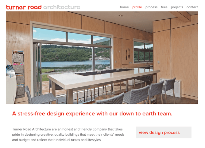
Make sure the big heading is the first text on the page and is near the top of the page
Don’t put any other text above the big heading and either put the big heading at the top of the page or directly under a large eye catching image. It’s ok to put the big heading in it’s own stack and make this a full page width stack. By the text being very large and not longer than two lines, it’s still quite easy to read even though the lines are long.
Next: Add the text to the page and break it up with punchy headings
Use either a ⅔, ⅓ stack or a ¾, ¼ stack and put the text in the widest column. By not making the text go the full width of the page it makes the page feel less overwhelming and actually easier on the reader to digest. It’s a good idea to have a decent amount of text on your about us page. You don’t want to overcook it but a single short paragraph will probably reduce trust. If you do have several paragraphs of text on the page, break it up with good headings that explain the text in the paragraph below the heading. People like to scan pages so headings are very important for making sure the information is seen.
Some businesses have a lot more information to put on an about us page than others so if you need to cover off your history, staff, awards, qualifications, testimonials, case studies or business partnerships, that’s fine. Just make sure you order that content from most important to least important with clear headings for each section and eye catching images that are relevant to each section.
TIP: Rocketspark makes it easy to add headings throughout your content. Rather than putting all of your text in one text block, have a separate text block for each section. The text block feature has a heading option, just enter the heading there. This also makes it fast and easy to rearrange the order of sections.
Where should the call to action go?
If you’ve used the ⅔, ⅓ stack or ¾, ¼ stack above with the text in the left column. The right hand column is the logical place for the call to action. It’s still important real estate as it’s high up the page but it’s not competing head on with the text and big heading. It’s a flow on from that in terms of visual focus.
People read a page left to right, top to bottom and we know from eye tracking studies of website visitors that the top left of a web page is viewed the most. That also means it’s usually where they look first. So why not put the call to action on the left and the text on the right? Your call to action should be in response to some sort of information the visitor has received on the page. If the call to action is the first thing they read on the page it can feel jarring and presumptuous for the visitor who wants information before responding.
The best about us pages are focussed on the goal of building trust with visitors by playing to the assets of the business - it’s that simple. What are your best assets? What will make visitors trust you?