Choosing your website page names. Why only 8?
A website needs to engage visitors quickly or they will leave in a matter of seconds. If you give people more choices, the decision process takes longer and they are less likely to find what they’re looking for before they decide to leave.
Short term memory can only handle a few things at once
Some research puts the average human’s working memory to be about 7 things at a time but some suggest it’s as low as 4. If you have more than 8 pages in your website’s navigation menu, by the time a visitor reads each page name they may have forgotten what the first couple were. The reason for having 8 pages or less in a website’s menu is to make it faster for the visitor to find what they’re looking for.
Although many prefer the fastest option and will just click the main call to action on the page, the website’s main navigation menu is still popular with visitors. On an older version of the Rocketspark home page, none of our call to actions on the page linked to our pricing page but this was still our most visited page after the home page and it was only in the main website navigation menu.
Selecting page names - What do your visitors want to know?
One of the most common mistakes businesses make when setting up a website is to have every single piece of information about their company on their website. If the goal of your website is to generate leads, overloading your website with too much detail just slows down the time it takes your visitor to make contact with you. Limiting your main menu to 8 pages or less will help you focus on the content that is going to be most effective at converting visitors to leads.
Check out our user guide of page name suggestions and how to change your page names on your Rocketspark website.
Even large companies have less than 8 pages in their menu
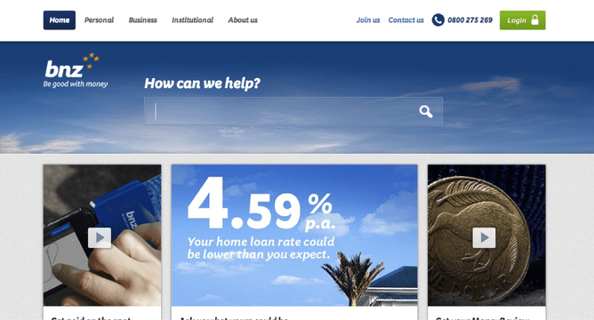
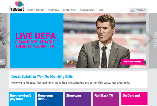
A common objection to having less than 8 pages in a menu is that it’s something for small companies and that large companies have more information to get across. The following examples show that even large companies with thousands of customers know the benefits of having a small number of pages in their main menu.
Xero:

BNZ:
freesat:
Related information should go on the same page - use good headings
Another common mistake is to have a separate page for every separate piece of information. Every time someone has to click to another page, it increases the likeliness they’ll leave your site because they have to think about their decision and how to find what they’re looking for next.
It is better to group related information on the same page under clear headings. If someone comes to your “About” page to find where you’re located, they might also be interested in your company profile or who your staff are. Don’t be afraid of making pages a little longer. Scrolling is a really comfortable action for even the least savvy visitors. Just make sure the headings are clear, regular and descriptive to draw visitors down the page - most visitors scan headings rather than reading paragraphs.
Drop down menus are a bad idea
For non-savvy visitors, drop down menus can be awkward and frustrating to use.
They don’t work great on touch-screen devices as you can’t hover your mouse over it.
It makes the user have to think even longer about where to click.
If they’ve moved their mouse over the menu item they might have decided to click on that menu item. Presenting them with a drop down can be disorientating.
Although Xero use a dropdown menu for the “More” menu item in the example above, most visitors to their website will fall in the SMALL BUSINESSES or ACCOUNTANTS & BOOKKEEPERS category. This means the “More” option is only for the user who wants to dig a little deeper and these visitors won’t have difficulty with the drop down.
Looking for something specific in an online shop
E-commerce can be a little different but the same rules still apply. In an experiment with Rocketspark online shop customer Coffee Online, we removed “Products” as an option from their menu and shortened it to Home, About Us & Contact Us. They saw a noticeable increase in sales simply by removing the extra page and putting more emphasis on the main call to action where visitors could view all products.
Someone might be looking for a particular brand and having a brands list on your home page makes it faster for them to find what they’re looking for. The ultimate goal of every home page should be making it as fast as possible for visitors to find what they’re looking for.
Mega drop downs are now quite popular with large online retailers that have an extensive range of different products. They can still get the benefits of having less than 8 main menu items but present the visitor with a large number of relevant categories once they move their mouse over the main department that they’re interested in.
Not every page on your website needs to be in your main menu
Sometimes you might need extra pages on your website than 8. As standard a Rocketspark website comes with 20 pages but you can request more. You can set up buttons and text links to link to these extra pages. Extra pages might be useful if you want separate pages for individual projects that you link to from your main Projects page.
Carefully select the page names for your menu. Keep it at 8 pages or less in your menu. Keep your content punchy and punctuated by clear headings. Doing this will make your site faster to navigate and easier for visitors to find what they’re looking for.
Extra reading:
How to change your page names on your Rocketspark website
How to change your page order on your Rocketspark website