What's NewDesignConvertingSeo-reportingBloggingEcommerceCustomer storiesSocial-mediaDomainsAllCovid-19AISEOWebsite DesignAccessibilityAccounting/BookkeepingBrandingCodingGenerosityIntegrationWidget
TAGS

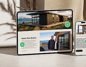
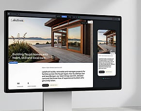
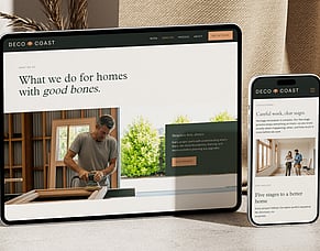
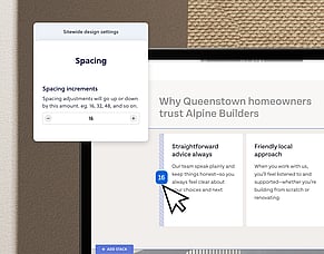
Designer Debrief: How Katrina Wilson gave Faulkner Construction a website as bold as their branding
June 16th 2026 Designer Debrief is our behind-the-screen look at how Rocketspark designers build award-winning websites. Not just the finished pixels, but the choices that help a site win awards and do its job. Read more