Designer Debrief is our behind-the-screen look at how Rocketspark designers build award-winning websites. Not just the finished pixels, but the choices that help a site win awards and do its job.
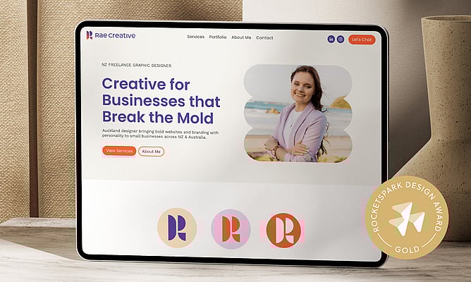
This time, we’re stepping into the build behind Rae Creative, a Gold Rocketspark Design Award winner, designed by Laykanne Coetzee.
Laykanne didn’t find out about winning in a formal email, or with a big announcement. She stumbled across it.
“I tended to ruin my own surprise on that,” she says. “I was looking for a reference for another website… and as soon as I clicked on the awards for that month, I saw my website there.”
She recorded it straight away.
“I took a video recording for my family back home and I sent it to hubby,” she says. “I was quite over the moon about that.”
It landed as a real milestone. Especially after the work it took to get her own site out into the world.
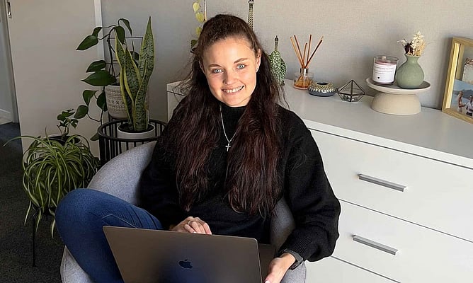
Meet the designer: Laykanne from Rae Creative
Laykanne is the owner of Rae Creative, a freelance graphic design studio based in Auckland, working across branding and websites for small businesses in New Zealand and Australia.
Rae Creative has been running for “about a year and a half, almost two years”.
“Still new to the freelance world,” she says, “but I’m super grateful for where I am and excited for where I’m headed.”
Building your own site is different
“Needless to say, it took over a year to build Rae Creative’s website,” Laykanne says.
When you’re designing for a client, the process has momentum. There’s a brief, a timeline, a feedback loop. When it’s your own site, everything gets blurrier, because the work is tied up with identity and confidence, not just deliverables.
“I think it was just a case of me not being fully confident within who I am,” she says. “It was the very beginning of my freelance journey.”
She was also doing it without the sounding board that makes creative decisions feel easier.
“I was doing that very much alone. I didn’t have anyone to kind of talk to about it or bounce off ideas or kind of get some feedback on,” she says. “And it’s very hard to get feedback from outside people, especially those who don’t understand creativity or websites.”
And then there’s the practical reality of freelancing.
“When client work pops up, you tend to put your own work on pause,” she says. “At the end of the day, you’re gonna always put your clients first.”
The loop: love it, hate it, question it
Laykanne describes the brand process as a cycle.
“There was a lot of backwards and forwards on the branding,” she says, “going through that grief process of when you absolutely love it and then you hate it and then you’re just not sure.”
She also noticed how much pressure comes with being visible.
“I think as designers or creators, we put a lot of pressure on ourselves in terms of who’s watching or what people might say,” she says. “And that was very much the case with me.”
The shift came when she stopped waiting for perfection and focused on getting it live.
“I got to a point where I decided that I just needed to get something up,” she says. “And that if it wasn’t 100 percent perfect, that that was okay, as long as it’s 90 percent perfect.”
Because for her, the site wasn’t just a nice-to-have. It was credibility.
“There was nothing to show for a creative,” she says. “And it just got to the point where I couldn’t tell people that I build websites if I don’t have my own.”
What pushed it over the line
A very practical deadline gave her the final push.
“With the marketing club events that happened last year… that also gave me that push and that drive to get my website complete,” she says. “So that if people were looking for me, it was easy enough for me to just share a website link.”
“It was very last minute invites to that event,” she adds. “So that was like the dynamite that I needed to kind of just push me over the finish line.”
The brief, in her words
Laykanne kept one goal front and centre.
“The main goal for me was I didn’t want my website to come across as overly formal or as a design agency,” she says.
Instead, she wanted visitors to understand the relationship they were walking into.
“I want users when they visit my websites to get a better understanding of who I am and to understand that… you’re not working with a big agency, we’re working one on one.”
And she’s clear about what that means.
“I want people to know that I’m by their side,” she says. “We are equals and we become a team at the end of the day.”
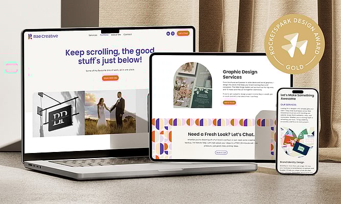
How she designed it: wireframes first, then build
Laykanne starts with structure before style.
“My process with it was very much… I usually just use a sketch pad with a pencil and… do rough wireframes,” she says, “laying that very solid foundation ensuring that A, the CTAs are in there, all the important information, so it’s where it needs to sit.”
From there she moves into Figma to explore the design system, but she doesn’t leave Rocketspark until the end. She tests ideas in the platform as she designs.
“I went through the process of building in Figma as well as in Rocketspark at the same time,” she says, “just to experiment and see what the Rocketspark platform could do.”
“It made it easier knowing what are the capabilities and what are the restrictions,” she says, “and then kind of working around that.”
Once she was happy with the homepage, she used it as the anchor for the rest.
“Once I got to a point where I was happy with the homepage,” she says, “that was kind of my intuition to then jump into Rocketspark… and then build on to the linking pages using the main homepage as inspiration.”
She keeps it simple: “If it works well, then don’t change it.”
Bold colour, on purpose
Laykanne deliberately went against the muted freelancer palette trend.
“A lot of freelancers are going through the phase now where it’s very muted colours,” she says. “And while those are beautiful… that was my first instinct.”
Then she chose a different path.
“Doing the opposite with my colour palette was quite the challenge for me because it’s very much outside my comfort zone,” she says.
But she knew what she wanted it to do.
“It’s going to stop you in your tracks,” she says. “It’s going to get your attention. You’re going to be like, okay, what is this? And that’s exactly what I wanted when I created Rae Creative.”
The meaning inside the logo
The logo is a strong brand device, and it’s also personal.
“The shapes… it’s quite symbolic to me,” she says. “I am one of three siblings… I’m the youngest and I’ve got two older brothers… they’re very important to me.”
“So that aspect is kind of brought into my logo,” she says, “using the three shapes per letter.”

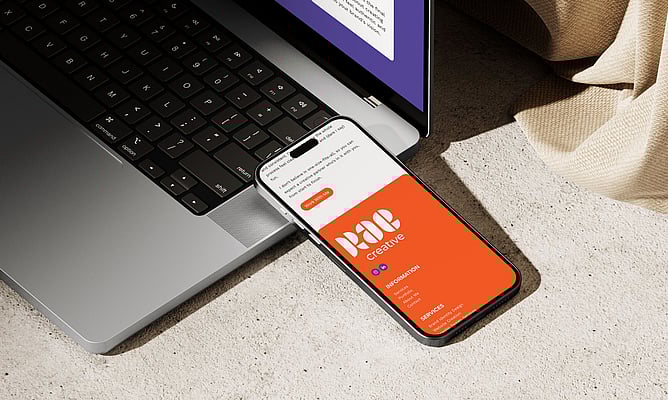
The animated logo, and why she outsourced it
The animated logo is one of the most memorable parts of the site, and Laykanne is candid about what it took.
“I wanted to have something animated for my logo,” she says, “but it’s extremely hard to create.”
“So I attempted to animate my own logo for quite a long time,” she says. “Lots of sleepless nights, lots of headaches, going backwards and forwards and just trying to figure it out.”
Then she made a decision that a lot of designers will recognise as both creative and practical.
“Animation in itself… it’s its own industry and there’s a huge learning curve,” she says.
So she outsourced it.
“I wish I could say that I animated that logo myself,” she says, “but I think I got to a point where you know when you need help from an outside resource.”
Contact page: keep it easy, keep it useful
Laykanne treats the contact page as a moment where the site should feel simple and friendly, not like an obstacle course.
“The contact page for me I find is always usually the most simplest page when it comes to websites,” she says. “You want to make it as easy as possible for people to reach out.”
She uses the form to gather meaningful detail up front.
“I made use of the Rocketspark contact form and kind of just gave users the options to provide as many details as possible,” she says, “so that when that’s coming through to me, I have an idea of who the client is.”
She also added the option to book a free 20-minute call as a fit-check.
“I want to give clients the chance to… have that introductory call, see if we would actually be a good fit from both sides,” she says.
“It’s almost like a mini interview phase.”
And she brings it back to visitor experience: “You want users to be able to navigate quite easily and get through it quite quickly.”
What she’s most proud of
When asked what she’s most proud of, Laykanne’s answer is simple.
“Probably… just the fact that it’s completed and that it’s out there in the world,” she says.
And then the award becomes a kind of confirmation.
“The cherry on the cake was obviously winning the gold award,” she says. “It was just the acknowledgement that my hard work did pay off.”
Two things Laykanne would tell other designers
Try things and break things
“I’d probably say for any designers, especially using Rocketspark, would be to just experiment,” she says. “Experiment with what the system currently has and kind of use it to your advantage.”
“I think as creators, we’re so used to working with layers,” she says. “If you think about working at it as layers, there is so much more that you can do within the platform.”
And she makes it practical: “Experiment… break things, build them back up.”
Protect time for your own business
“If I could go back a year… the only thing I would change is that I would set more time aside for myself and for work within the business,” she says.
“Before you realise it, you’re super overwhelmed with work,” she says, “and you know, there isn’t actually time to work on your own business.”
And her advice is simple: “Probably focus on my website first.”