Designer Debrief is our behind-the-screen look at how Rocketspark designers build award-winning websites. Not just the finished pixels, but the choices that help a site win awards and do its job.
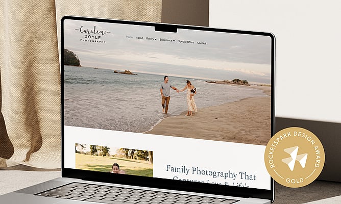
This time, we’re stepping into the build behind Caroline Doyle Photography, a Gold Rocketspark Design Award winner, designed by Liora Pine from The Little Acre. From the moment the homepage loads, the site feels warm, calm, and confident without being busy. Every choice keeps the spotlight where it belongs: on Caroline’s photography.
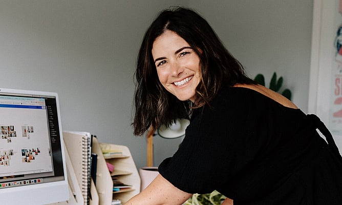
Meet the designer: Liora from The Little Acre
Liora describes The Little Acre as a strategic graphic design studio, focused on going deep on the business behind the brand.
As she puts it, her work is about creating design that is “not just beautiful but works for what they’re needing to achieve for their end goals.”
That lens matters, because the best-looking site in the world is not much use if it does not turn the right visitors into enquiries.
The origin story: a strategy session that turned into a full rebuild
This site did not start as “let’s refresh a homepage”. Caroline first connected with Liora after winning a strategy session Liora donated to a charity auction ♥️ That session turned into a deeper rebrand, moving from Caroline’s maiden name to her married name, reflecting a shift in life and work.
From there, it naturally flowed into a full website rebuild. Caroline had a DIY site from years back. The new goal was a site that felt professional, and that truly showed off the work.
The brief, distilled
Liora anchored the build around three outcomes:
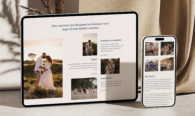
Showcase the work (without distraction)
Make location and offering clear (so the right clients self-select quickly)
Drive bookings and enquiries (with a simple, obvious next step)
Those bullet points read straightforward. The hard part is making them feel effortless.
A helpful way to think about it, especially for photographers and creatives, is this: the brief is not complicated, but the design has to remove friction. The site needs to make it easy for someone to think “yes, this is my style” and “yes, I know what to do next” without having to work for it.
Liora summed up the priority in one line: “That’s literally what she’s selling.”
Collaboration and feedback
Liora’s process is to build enough early to confirm direction, then use a few key pages to gather focused feedback.
“I like to first build out the home page so I can make sure that I'm getting the right look and feel, the vibe.”
Even with the sitemap confirmed, she’ll often build the navigation early too, so the client can experience the structure as a visitor would. From there, she prototypes important pages (like galleries) before rolling the design out across the full site:
“There are certain key pages. So for example, galleries is quite an important page. I'll build one first as an example so that they can provide feedback.”
In Caroline’s case, that feedback loop led to a clear improvement. They removed soft watercolour background elements so the photography stood out more.
The copy constraint
With photography clients, the images are often the easiest part of the build. The bottleneck is usually words. Not because people cannot write, but because layout depends on what the content actually is.
“If you are going to write really long website pages versus really short, that really changes the design.”
That’s why her preference is to work with real content early:
“I like to work with what I’m given to best suit that rather than what I think is best.”
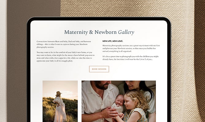
Liora’s favourite part: the About page layout
When we asked what she was most proud of, Liora didn’t point to the homepage. She pointed to the About page.
“So my favorite page is actually her about page, not even the homepage.”
About pages are where trust is built. People want the story, the approach, the feeling. They also want to keep seeing the work. Liora’s focus was making the text and imagery sit together naturally:
“I like that page the most because … I made the text and the imagery flow so nicely together.”
This is where designing for photography becomes more than “a clean layout”. Liora talked about “not compromising the photos by having to crop them into certain spaces.” When the product is visual work, the design has to protect it.
Designing in Rocketspark: Liora’s workflow
Liora designs directly in Rocketspark rather than creating a polished mockup elsewhere first. For her, it’s partly experience and speed:
“It definitely helps me reach deadlines a lot faster.”
Not everyone works this way, and that’s fine. The takeaway is broader: design with real constraints early. Whether you prototype in Rocketspark or build wireframes first, you want to avoid falling in love with an idea that cannot translate cleanly to desktop and mobile.
Why this site won Gold
Gold award-winning sites tend to nail the same fundamentals: a clear goal, a cohesive visual system, and a visitor journey that makes it easy to take the next step.
In this build, that shows up as:
Warmth and authenticity through photography that draws you in immediately
A clean layout and restrained typography that supports the imagery
A neutral palette and minimal design that feels calm and professional
Cohesion across the site, including distinctive stack layouts and a footer that’s both polished and genuinely useful
The result feels personal and professional at the same time, which is exactly what family photography clients are hoping to find.
Liora’s advice for designers aiming for award-level work
Liora’s advice is practical, experienced, and very repeatable: “I’d say go with your gut.” But she pairs that instinct with process: “If you do have that knowledge and if not do the research.”
Then she brings it back to what makes the site better, not what makes the designer feel clever: “Making sure that you don’t put your goals and your needs before the client.”
Want to be featured in Designer Debrief?
If you are a Rocketspark designer building standout sites, we would love to hear from you.