COMING SEPTEMBER 2025 FOR ALL EXISTING WEBSITES
You asked, and it’s nearly here! You can add buttons side by side to your Rocketspark website—each with its own style, editable directly on the page. No workarounds. No code. Just a simpler, more flexible way to design with buttons.
This feature update is live and available for all websites created after the 10th of September. Sites created before this date will gain access asap as we gradually roll out the update. We’ll let you know the moment it’s ready for your website.
Why put two buttons next to each other?
Putting two buttons side by side gives people options without overwhelming them. You can make one button stand out (like Contact us) while the other takes a softer approach, like About us. It guides visitors while letting them choose what feels right for them.
What’s new
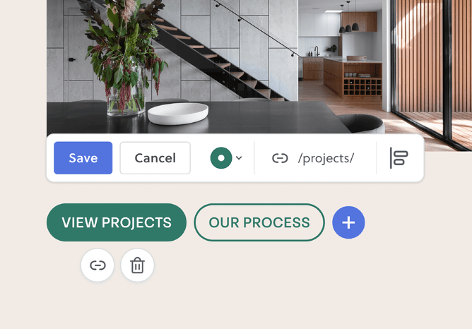
Add more than one button, side by side in a block
You can now add two—or more—buttons next to each other in the same block. Just click the + icon to add another.
Handy for layouts like:
“Buy now” and “Learn more”
“Book now” and “Contact us”
“See pricing” and “Watch video”
Each button can be aligned left or centre, and spacing between them adjusts automatically to keep things looking tidy.
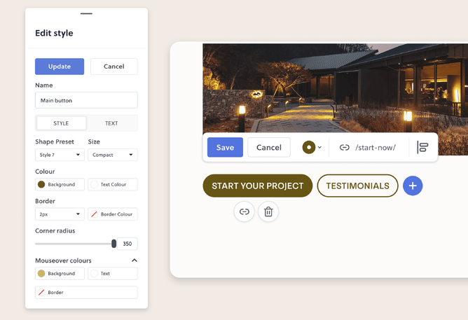
Each button in the block can have its own look
Want your first button bold and eye-catching, and your second one a bit more subtle? You can do that now.
Each of the buttons in a block can have its own look:
Colour
Size
Corner shape (sharp or rounded)
Font and letter spacing
Hover effect (like colour on mouseover)
Side-by-side buttons automatically match font size, corner shape, and casing of the first button—so everything lines up nicely without you lifting a finger. Prefer to fine-tune each one? You’ve got the option.
Reusable button styles that update everywhere when you edit them
You can now set up saved button styles—just like your brand colours and fonts—and reuse them across your entire site.
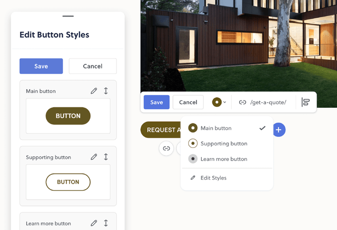
Want to tweak a colour, font, corner radius, or casing later? No need to update every button one by one. Just make the change once, and every button using that style updates automatically.
This makes it easy to stay consistent—and saves loads of time if you ever want to refresh your design later.
Give your header button its own unique look
Until now, your header button always followed your site’s default button style. You could tweak the colours—but that was about it.
Now you can set a dedicated style just for your header button. Choose the size, shape, font, colour, casing, and more—without it affecting any other buttons on your site.
Want to keep things simple? No problem. It’ll still use your default style automatically.
More control when you need it. No extra steps when you don’t.
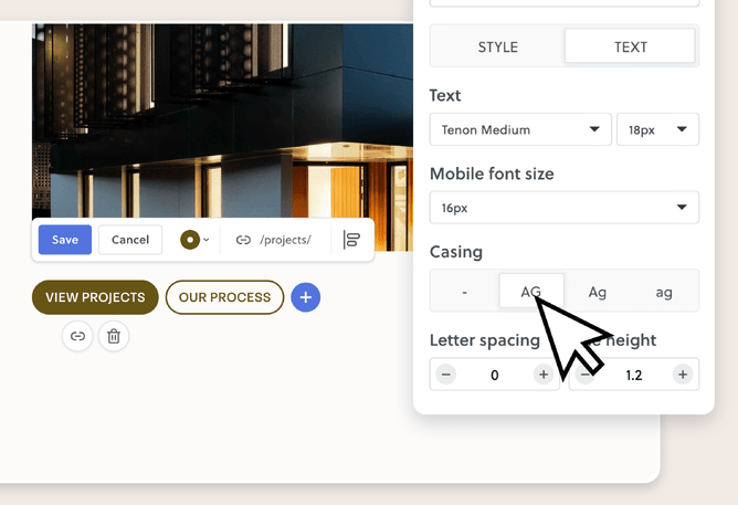
Set the casing once, and forget about it
If you’re a designer, this one might save you a few headaches.
You can now choose how button text is styled—like ALL CAPS or Sentence case—as part of the style itself. That way, your client doesn’t have to remember to type things a certain way. Just pick the casing style once and every button using it will follow suit.
Mouseover styling (hover settings)
You can now set what happens when someone moves their mouse over a button—known as the hover or mouseover effect.
Change the background colour, border colour or text colour on mouseover to match your brand’s style. This extra detail helps buttons feel more interactive and polished.
Precise control over how round your button corners are
You can now set the exact corner radius for each button style. Go sharp, slightly rounded, or fully pill-shaped—it’s up to you.
Prefer to keep it simple? Quick presets are still there too.
For ecommerce: primary and secondary button styles
Online shops often need more than one button style. You can now set both a primary and a secondary style—so “Add to cart” and “View more” can each have their own look, while staying consistent with the rest of your design.
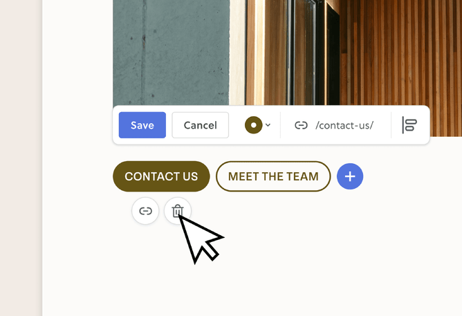
Edit buttons directly on the page
You no longer have to open a separate popup to edit a button. You can:
Type button text straight into the button
Watch it resize as you type
Add or update the link right there in the editor
Delete or rearrange buttons easily
It’s all designed to feel smoother and more visual—so what you see is what you get.
Mobile friendly too
Tweak your button text size on mobile and buttons will automatically stack on smaller screens to keep things easy to tap. It’s all built in—no extra setup needed.
Why this update matters
This update gives you more flexibility to match your buttons with your brand and your layout—without needing extra stacks, custom code, or design hacks.
If you’re a designer, it helps keep your site styling consistent, even after handover.
If you’re running your own site, it just makes things easier to manage.
Better buttons, done simply.
Just one more way to make your site feel like you.