
To fully understand why Rocketspark now offers full Responsive Web Design, it’s helpful to understand the history of mobile-friendly websites and what’s brought us to this point.
It’s not 1999 anymore
Since the birth of the internet, a lot has changed about the screens people use to view websites. Since the 1990’s we have seen the rise in popularity of large computer displays, smaller laptop screens, mobile phones with touch screens, tablets and now large screen phones. The web industry has been scrambling for the last 4 years to optimise existing websites for mobile phone screens. Rocketspark has been mobile-friendly since early 2013 and even before the launch of full responsive websites, our websites passed the Google Mobile Friendly test which was important for your search rankings.

So why did the web industry focus on mobile initially?
When smart phones with touch screens came out that could browse the internet, it was clear that a regular website couldn’t be sized down to fit. For one thing, the screen shape is tall rather than wide and small links and buttons are difficult to tap with your finger. A website that isn’t optimised for mobile is on the borderline of unusable on a smart-phone. Google has also been the instigators of change in this area, even going so far as penalising websites in search results if they aren’t mobile optimised.
Considering the hundreds of millions of existing websites around the globe that were not mobile-friendly (and many still aren’t), this created a huge challenge for web developers to make existing websites mobile-friendly. Initially it was much faster for web developers to code up a mobile optimised version of an existing website, rather than optimising the design of the website for every screen size.
While smart-phones were relatively new, website traffic from a phone was quite low but as of October 2016, more people globally are accessing websites from mobile phones than desktop computers—accelerating the transition to mobile-friendly.
By comparison with mobile, regular websites are still usable on large screens, tablets and small laptop screens. They might look strange with large amounts of space to the left and right or be a bit cramped but ultimately they are still usable.
Moving from Mobile-Friendly to Responsive Web Design
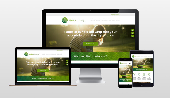
Yet again Google are driving change in this area and in their guide to mobile-friendly websites, they recommend Responsive Web Design so that the same website content is optimised for every screen size. Rocketspark now offers full Responsive Web Design, view our blog post to find out in more detail what this means for your website.
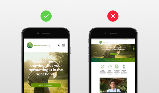
Taking Mobile Responsiveness even further with Mobile Feature Area design controls
We've taken mobile web design even further with Mobile Feature Area design controls.
This feature has been added to the Rocketspark website builder so you can make adjustments to your images and text to suit the portrait format of a mobile phone—which is very different to the wide landscape format of a desktop screen.
See the help guide on how to use the Mobile Feature Area design controls.