Lead your industry with a beautifully simple website that viewers love to visit on their mobile device.
Right now, we’re leaping through the mobile era, with many Rocketspark customers now getting more visitors on mobile than desktop—In some cases the amount of mobile traffic has doubled in the space of a year. Google/Purchased stats indicate that 89% of people are likely to recommend a brand after a positive brand experience on mobile. As a result, Google has introduced Mobile-first indexing, where Google uses the mobile version of your website for ranking. It’s really become a necessity to have a cutting edge website, with a mobile browsing experience that’s quick, pretty, and easy-to-use.
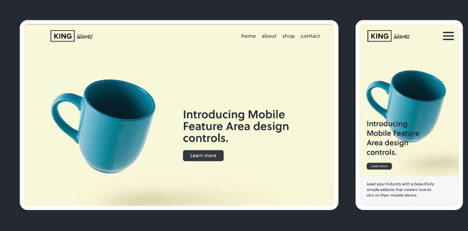
The area on your mobile website that viewers see first should instantly grab their attention and inspire them to want to know more. This area holds a lot of weight for you and your business and we like to call it the Mobile Feature Area.
Rocketspark websites have come a long way in the past few years from being just mobile-friendly (the ability to view websites on a mobile device) to being fully responsive (where images and text automatically scale to fit different screens) to now—being able to make adjustments with Mobile Feature Area design controls.
The new Mobile Feature Area design controls let you make adjustments to your images and text to suit the portrait format of a mobile phone—which is very different to the wide landscape format of a desktop screen. You can now separately adjust the height of the Mobile Feature Area for optimal mobile design and move your feature area images to make sure your focal point is, well, on point! Plus you can adjust the size and position of text in the mobile feature area so it fits just right.
Go straight to the help guide to learn how to adjust your feature area image and text to suit a mobile screen.
Uncompromised images
Adjust the height of the Mobile Feature Area for a better view
Control which part of an image your viewers see first when they visit your website on their mobile device. In your Mobile Feature Area Design controls on your Rocketspark dashboard, you can drag the slider up to reduce the height of your Mobile Feature Area and to show more of the image—handy for detailed images like team photos or pictures that contain graphics with or without text. The slider also cleverly scales your image proportionally so you won’t be unintentionally squashing or elongating anything in your image.
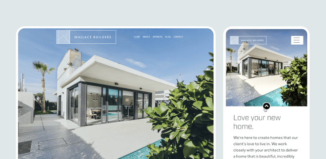
Get high impact visual appeal with a full-height Feature Area on desktop, without worrying about how this will translate to mobile. With Mobile Feature Area design controls, you can disable full-height Mobile Feature Area with one click, then make adjustments to ensure your mobile viewers are getting an equally attention grabbing experience.
Slide the image sideways to reposition it on mobile view so you don't leave anyone, or anything out
Getting the focal point of the image in view is easily done by using the slider to move the picture horizontally. This is also a great way to crop out any non-essentials that might interfere with your design.

Typography for beautiful design
Worried about text getting cut off or being placed undesirably over the focal point of your image in your Mobile Feature Area? Give your website visitors the best viewing experience possible by adjusting your image/s and text content specifically for the mobile format using a combination of the following two settings in your Mobile Feature Area.
Text size controls for neat headings, blurbs and buttons
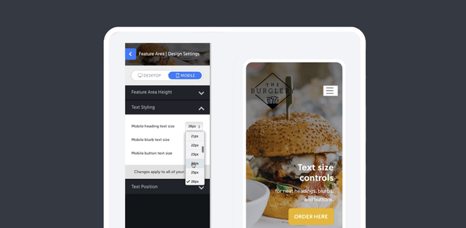
Tweak the Text Styling in Mobile Feature Area by separately adjusting the size of your heading, blurb and button text for maximum visual appeal and function.
Adjust text positioning to suit your image layout
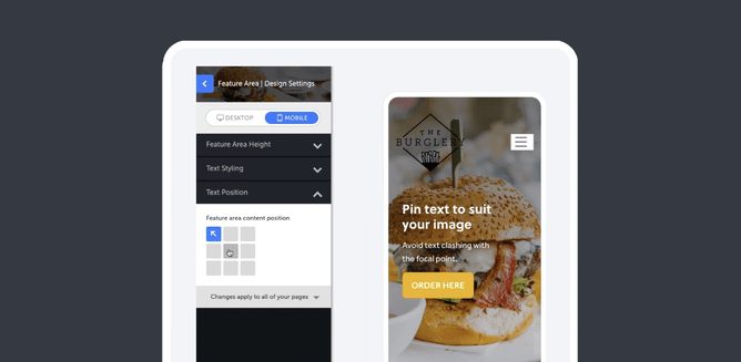
Nobody likes text that clashes with the focal point of an image. Decide where you’d like to position the text in relation to your image then pin text to the left, right, or to the top or bottom of your Mobile Feature Area.
Grab your Mobile Feature Area by the horns and impress your on-the-go website visitors
Now you can design for both mobile and desktop screens—without compromising your design on either.
With Mobile Feature Area design controls, you can:
- Show more of your image/s in the feature area on a mobile screen by adjusting the Mobile Feature Area height.
- Position your image’s focal point where you need it to be - simply slide your image horizontally to suit.
- Resize your heading text, blurb text and button text to fit your mobile screen.
- Adjust the position of your text by pinning it to a corner or edge of your mobile feature area so text doesn’t overlap the wrong part of your image.
Learn how to adjust your feature area image and text to suit a mobile screen.