Gone are the days when you needed to start building a website from a pre-designed template. Now with the new Blank Template option, you can start afresh on a blank canvas where the header isn’t tied to a pre-designed template. You can have beautiful full-width headers that utilise the full width of the browser and choose different header layouts, getting your creative juices flowing. Design freedom is further granted with the introduction of the Header Overlay with the first Stack below Header, allowing you to have a transparent background to your menu. Finally, drive action on your website by adding a customised Button that stands out from the rest of your navigation.
Full-width Header for a modernised look
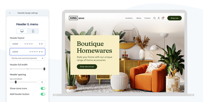
When you’re on a blank template, you can access a new set of header controls that enable more design flexibility for header styling. You can now go full-width, medium-width, or narrow-width with your header.
The full-width header option allows you to set the header elements to sit close to the edge of the screen, making a more professional and modernised-looking website. It places the left-aligned logo and navigation menu a bit further out towards the sides of the page, providing web visitors with a better visual effect when they browse your site on big or wider screens.
If you have a contact bar turned on that sits above your main navigation, your contact bar width will change alongside the change made to the width of your header menu, in order to keep all content in the header section aligned.
The full-width header is also more accommodating for navigation menus that have longer menu items. Following the best practice, you can still have up to eight pages visible in your main menu. Though, with the main navigation bar extended to the full screen width, things won’t look overlapping or crowded in your header anymore. See help guide for how to control your header width here.
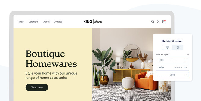
Choose your preferred header layout
The main header is usually the first thing people see when they land on your website. It also acts as the main navigation that directs visitors to the relevant pages to their interest. So there is no doubt you want to have a functional yet aesthetically pleasing header to guide and please your web visitors.
As part of the new header controls, we’ve added two header layouts into your design arsenal now at your disposal. You can either right align or centre align your main menu on the desktop using one of the header layouts to better suit the look and feel of the website you are designing.
UPDATED 21st Dec 2021: These new header layouts are the starting point for the new header editing controls and more header layouts are coming soon. We've just added a new layout with the logo being centred in the header, accessible through a blank template.
Header overlay first stack
Now you can overlay the header on your first stack of the page to create a different look. This will allow you to apply a transparent background to your menu area, revealing the photographic, illustrative or video background in the stack your menu overlays.
You can have Header Overlay used as a perfect complement to the Full-Width Header. As an alternative option to creating the overlaying effect with a transparent background, you can add a gradient colour overlay to enrich the theme you want to express in your header area. You have full control over the background colour of your header, the gradient height and opacity.
Highlighted button in menu for driving action
Drive action on your website by adding a customised Button to the end of the menu that stands out from the rest of your navigation. Having a clear call to action is critical in securing leads on your website. A prominent call-to-action button at the end of the menu will make it more accessible to your website visitors, drawing their attention and paving the way for their next steps.
You can style the button colour to match the buttons on your website and adapt the menu button to suit your website’s needs. Accommodation, tour, and salon outlets may use ‘Book Now’, restaurants with ‘Order Online’, charities with ‘Donate’, or schools with ‘Staff login’, to name a few. Then you can link your button to one of your pages, an external website or booking system. If you have an online store and are having massive sales going on, you might even want to have the button linked to the featured product or the sales category that you set up already. The options and opportunities that amount from the button are extensive for you and your website.
Or if you’re a service business, you could replace the contact menu item and contact bar with a contact button in your header that’s more aesthetically pleasing than the contact bar. It’s also more trackable in Google Analytics whether visitors are showing interest in your contact details than listing a phone number or email address in the contact bar, where clients may not be realising how many of their enquiries had actually been generated by their website.
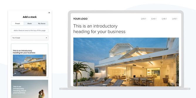
Blank template—start afresh and control header design without changing template
Having a clean canvas to start with, you can unleash your creativity to the full extent with no distraction from templated filler content. A blank template is the place to add your flair and show your custom design. You’ll be able to have more websites added to your portfolio that’re less “standardised” and more unique.
You’re now able to start a website from scratch on a blank template, tapping into your creativity and putting original ideas into place from the get-go.
This blank template option helps you save time at the beginning of a project, allowing you to build mockups designed in platforms like Figma and Adobe XD straight into a blank screen. This avoids the time spent on deleting unfavourable parts of a template or needing to customise a template to your satisfaction. There are no longer limitations from a template as you take full control of your design, freely.
If you ever need inspiration for the bits and pieces of a page, don’t forget Preset Stacks that you have access to on a blank template. Preset Stacks is a library of already-designed stacks, conveniently categorised by use. You also have access to all your most used and recently edited stacks when you add a new stack. For stack layouts you want to put in use repeatedly on a blank template, utilising Preset Stacks and your own frequently-used stacks can be a great way for fleshing out your site quickly.
You can always switch between a blank template and other pre-designed templates, if you need to. For either way of changing, you can be assured all your self-added and self-edited design and content will stay, including the font, sizes, and colours you set on your current template.
By selecting a blank template, you’ll also have more header controls that’re not tied into any specific template.
New look store icons
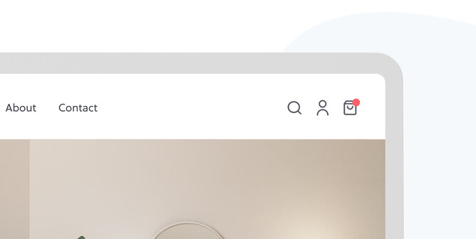
For Rocketspark websites that have an online store, you now have the option to show store icons in your header, which is a set of icons representing the shop search function, a shortcut to Customer Accounts and to the homepage of your shop. This is handy to web visitors who have a purpose in mind, either it be searching for a specific product or going to check their order history from their Customer Account.
Our new header controls have an implication on Rocketspark’s ecommerce websites —
The shortcut icon to shop homepage now has a new look as a shopping bag (as a replacement to the old shopping cart icon), which is more on trend with ecommerce web design and also more relevant to what it represents. The shopping bag icon reminds people of buying a product rather than shopping for groceries.
When you enable those store icons for an online store, they will always sit to the right of your header menu in the top right corner of your page, regardless of whether your header menu is right or centre aligned. You also don’t need to switch on the contact bar to show the store icons since the store icons are now displayed in line with the main menu. Or if you do have the contact bar enabled, you’ll have a clean look for it with only the email and phone number shown above your main menu.
More to come for header design flexibility
Currently in development and coming very soon, we’re already well underway on the following sought-after header features requested by our Design Partner community.
- Keep the main header sticky as scrolling down the page
- A new header layout with the logo positioned in the centre place.
To wrap-up
It’s time for creativity! Give it a go to start a new website project from a blank canvas template, and try out the new header layouts; header width controls, header overlay and button in the menu. We’d love to see what you’ll create and how you feel about using these new features.