Line height and letter spacing are equally as important as typeface when it comes to making written content look good. In fact, if text is hard to read and not broken down into manageable chunks it can distract from the content all together, decreasing engagement and confidence in website visitors.
What is line height and letter spacing?
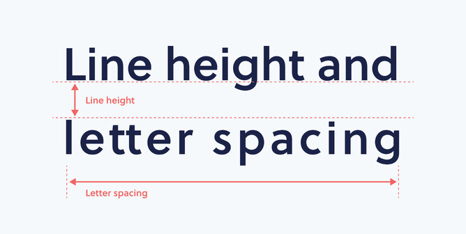
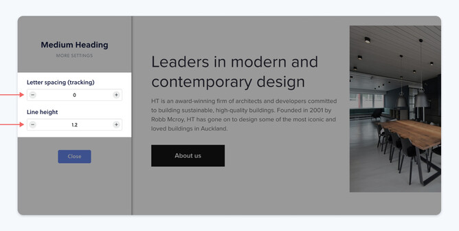
Line height, also known as leading, is the distance between each line when you have two or more rows of text. Letter spacing, also known as tracking, is the size of the gaps between each letter of each word.
Getting these two fundamental aspects of your text content correct can often determine how a customer responds to the information, and the website itself — therefore determining whether or not they consume critical information about your client’s business and how they feel towards the business all together.
How to choose the best line height:
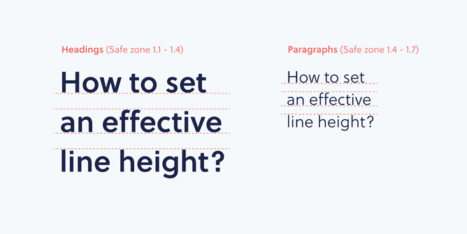
When working with Rocketspark, line-height is measured as a number with a decimal place value (e.g. 1.2). A safe zone to follow for headings is between 1.1 and 1.4 and the safe value range for paragraph text is between 1.4 and 1.7. Of course, these values are general guidelines and may vary depending on the fonts you are using.
When working with other creative programs such as Photoshop, Illustrator or Indesign, your line height will most likely be measured as a pt size. For example, if you have size 18pt text and you want your line height to be 150%, simply multiply your font size of 18 by 1.5 and you have the correct line spacing of 27pt (150%).
Smaller fonts are naturally harder to read so may require more line spacing to allow the eye to follow with more ease.
How to choose the best letter spacing:
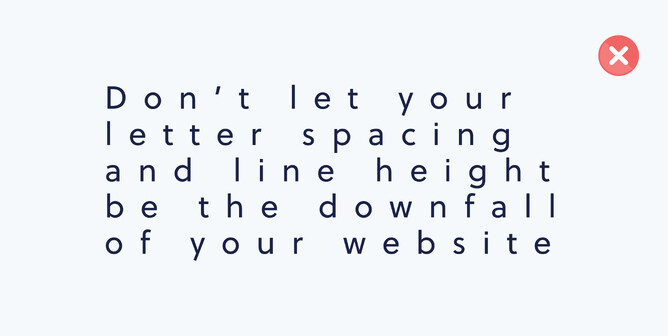
Correctly setting your letter spacing (tracking) is very important for the legibility of text. Fonts have default line-height and letter spacing settings, but they should be reviewed to consider the amount of text you have, or the font weight you are using.
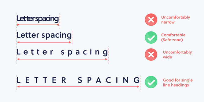
For example, when the letter spacing is too tight, visuals can look heavier and white space between letters and words can get lost. And when character spacing is too wide, white space between each letter can start to affect the definition between words. Having wider letter spacing makes your text appear lighter in weight.
Usually, body copy doesn’t require as much letter spacing adjustment as the main or sub headings. You might choose to set the letter spacing differently on headings from the body copy as a feature, or a heading scaled up might require adjustment for aesthetic purposes.
One-off headings or titles that have very wide letter spacing using all capital letters can be used well in design, as it can give the impression that something is luxurious, high quality or expensive. Knowing when and where to use techniques like this can be very effective, depending on the subject of your design or website.
How to choose the best font size and line length:
Font sizes of headings and body text is also a key factor for the overall flow and aesthetic of effective web design. Headings should generally be larger in size as they help quickly distinguish the topic of a website and visually separate bodies of written content into manageable sections for the reader. Headings should also be short in length as they are quick visual hooks to help the user navigate their way around a website quickly. With Rocketspark, you can adjust Heading and Paragraph font size separately for desktop and mobile.
Paragraph text is the smallest in size of all the written content on a website. It is generally the supporting content to a heading or subheading to give the viewer more detailed information about a particular topic. Here are some guidelines to follow when laying out paragraphs of text in web design:
- Consider your own attention span when deciding how much written content to have in one section. If there’s a chance you (as a visitor) would move on from the section without having finished reading, consider shortening it. If you don’t think you’d stop to read it at all, definitely shorten it.
- Try and stick to 16pt type as a minimum for paragraph text. This may vary slightly depending on fonts, but it’s a good guide to follow.
- Limit each line to a maximum of 75 characters. Longer line lengths become harder to follow and it’s easier for your client’s customer to lose where they’re at in a paragraph. In a situation where you might require longer line lengths, you can increase the line height for easier readability. Learn more about line length for websites here.
Designing websites for clients?
Rocketspark is an online website builder, purpose-built for Graphic designers, Marketers and VAs. If you can use Canva, you can use Rocketspark — and if you can design it in InDesign, you can design it in Rocketspark.
We have a loyal community of designers who choose to partner with Rocketspark to deliver their website service - click here to see why.