If you’re new to web design or are struggling to get your websites looking exceptional, while functioning well, there are some fundamental basic tweaks you can make for a better result.
Read on to discover 10 common web design mistakes, and ways you can avoid them.
A great website is not only about having all the bells and whistles, it's knowing how to strategically and aesthetically place your content. A website needs to have really clear call-to-action prompts, that guide the visitor and help them to navigate through to where they want to go, seamlessly.
1. A logo that’s too big and pixelated
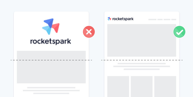
Having the logo at the top of the website is a fundamental element. The logo is the businesses visual recognition that’s memorable across all types of media. However, when placing a logo at the top of a website, a common mistake we see is to make it too large.
Making the logo too big, can push down key information relevant to the top-of-a-page positioning, to slip below the first-view fold. Having key content below the fold isn’t ideal, as for a first time visitor, you’ve only got a matter of seconds to win them over, to get them to stay.
It’s important when a visitor lands on a website that the key information is seen first. If you’ve designed a logo you love, it can be tempting to make it nice and large in the design but to get a feel for appropriate logo sizes, check out top websites from your favourite brands and compare their logo sizes with how you’re sizing logos.
Having a poor quality/pixelated logo at the top of a website is also really damaging for the reputation of the business and website. It’s one of the first things a visitor to a site will see. The logo is one the core elements to a businesses identity, and if the image is of poor quality, that can put doubt in a customers mind about the quality of the business. First impressions are everything.
2. Choice of fonts and font sizes
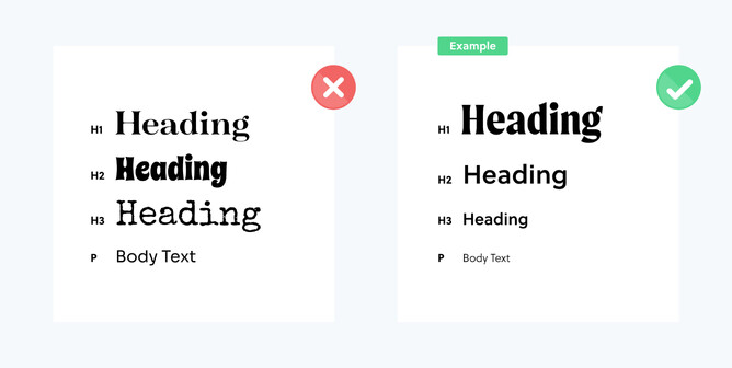
Choosing fonts and knowing how to use them can sometimes determine the visual success of the website you’re designing. Sometimes you don’t get a say when it comes to the fonts, as the brand or client you're working with has already determined the brand guidelines.
If you are choosing fonts, it's really helpful to do some industry-specific research to get a feel for what’s going to look good and make sense. For example, you probably wouldn’t use a graffiti style font for a retirement village website.
Having a contrast between header and body/paragraph text fonts is important for hierarchy and readability. The body/paragraph text fonts should be easy to read as this will be the meat of the content.
Using various font sizes consistently though your website will also help with readability and prioritising the importance of your content.
Depending on the size of the website you are designing, it’s common to use three to six different font sizes. Main headers should traditionally be the largest, sub headers second largest in size or weight, and body/paragraph text should be the smallest.
3. Large amounts of text and overuse of centered text
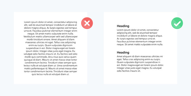
Large amounts of centered text on a website looks messy, but it also looks daunting to read and it’s hard to follow. There’s a reason books, magazines, newspapers and blogs all use left aligned text.
Predominantly use left aligned body text and break up your content with subheadings so it’s in manageable bite-sized pieces of content.
If there is no reason for subheadings, break your text up into paragraphs with adequate spacing so it's easier for the reader to navigate through large amounts of text. Ideally, avoid large bodies of text all together if you can, but in some instances it's necessary.
4. Loooong line lengths
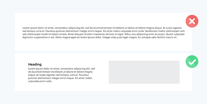
Line length is the amount of characters you have in a single line of text. A common mistake is having your paragraph text line length tooooo long. It makes it more difficult to read and doesn't look as visually appealing on a website either.
It’s recommended that a line length of between 50-75 characters is the optimal range of length. Please see our blog specifically focusing on line length here.
5. Number of buttons and inconsistencies
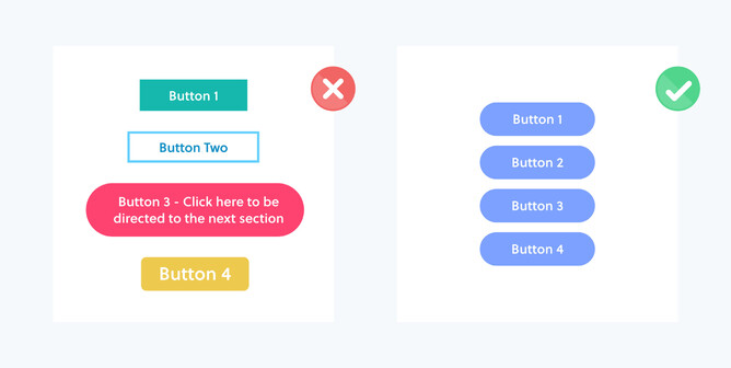
One of the key elements needed to navigate your way around a website is the use of buttons.
Keeping your buttons consistent in size, style and colour will help with the overall design aesthetic of a site. Rocketspark has separate button editing tools for the mobile version and the desktop version of a website, so you don’t need to compromise on great design here, ever.
When buttons all look the same, they become visual hooks of consistency and make each call-to-action clearer. See the help guide here.
Keep the amount of buttons on a webpage to a minimum where only necessary actions need to be made. Providing too many buttons on a webpage makes it difficult for the user to prioritise exactly where they need to navigate.
It’s good to keep the amount of text in a button to a minimum so the call-to-action is clear and simple. For example, Instead of saying “Contact me now about your enquiry”, use something more simple and shorter, but still to the point. For example, “Get in contact”.
6. Impersonal stock images/bad photography

Photography is often a large element of the content on a website. No matter how beautiful your website design is, if you have bad or poor quality photography, it will dramatically impact the visual and emotional qualities of that website.
Stock images are a great way to introduce high quality photography to a website, especially if there is no budget or time to do a custom photoshoot. Stock photos are often very recognisable as being “stock”. However there’s now some great NZ-based commercial image banks offering uniquely local, high-quality content from top photographers from around Aotearoa.
However not all stock is created equal.
When using stock photography, you’ll need to ensure that the image is portraying the exact emotions and feelings you had in mind and overall adding to your brand story. For example, look beyond just choosing a “travel image” if you’re designing for a travel company – check the style, the composition, the grade (image colouring), the accents & style of props, making sure all factors combined add to your overall aesthetic. RAW image files can also give a designer control over tweaking colours & grades to match a brand style.*
Custom photography will always be the preferable option when it comes to images on your website—so if you aren’t a photographer and don’t have the right equipment to capture high quality images, it’s well worth the investment to hire a professional. Obviously the initial cost of creating the website will go up, but the benefits will outweigh the cost over time.
Custom photography makes a website personal and engaging as you can create the outcome you desire.
*Picky, NZ’s newest stock marketplace provides authentic, high quality, crafted imagery created by top photographers from all around Aotearoa.
7. Not using hierarchy
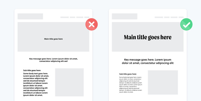
Hierarchy is the order of priority of your content and visual elements from most to least relevant. For example, on a website the logo and menu are at the top, followed by a main image and text describing what your website is about. It gives the visitor the key information about the business and whether they want to keep viewing.
Hierarchy is a core principle of how a user processes content on a website. When a user visits your website, you often only have seconds to convince them that they should stay. It’s important to use headers to categorise information, and use consistency in colours and style to create natural pathways through your website.
A common mistake in website design is not prioritising the key elements of the content, which can result in the user getting lost in a jungle of text and images, making the website much less effective.
8. Incorrectly spacing content
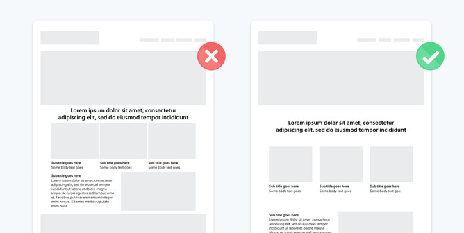
Correctly spacing content on your website can often be as important as the content itself.
Even if you've got exceptional content that’s advantageous to the business or a product that business is selling, if it is crammed together, it’ll likely get missed.
Spacing content helps build hierarchy and contrast between the sections of information on a website. Correctly spacing your content can improve readability by up to 20%.
Don’t be afraid to use space as a key element in your website design. This is often referred to as negative space or white space. Negative space is blank areas on a page between and around content. Negative space can also refer to an area of a photo outside of the focal point.
Creating space on a page actually helps draw attention to what's important. Without space, you can't create a focal point. Give your content the breathing room it deserves.
9. Leaving the mobile experience as an afterthought
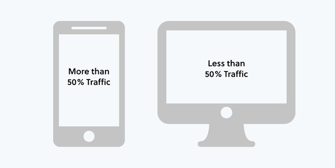
A common web design mistake is to solely focus on designing the desktop version of a website and leave mobile as an afterthought.
But the fact is, more than 50% of people will view your site on their smartphone. So if you're not considering your mobile design and functionality you're potentially neglecting the largest portion of your site traffic. You can learn more about Rocketspark’s mobile-specific editing tools here.
Keeping your considerations for desktop and mobile design evenly weighted from the start of the project will be much more beneficial to the success of the way your website is viewed and used across all devices.
Read How to optimise a website for mobile in 5 steps.
10. Using image backgrounds incorrectly
Choosing good background images for a website plays a key part to the overall user experience of your site.
They not only look good, but they provide emotion and help communicate messages in a deeper way than text can do.
Two common mistakes are not only using the wrong images in headers, stack backgrounds and footers on a website, but also using them in the wrong way.
When you are using background images, try to provide contrast between the content sitting on top. When text is overlaid on a busy background image, the written content gets lost and becomes difficult to read.
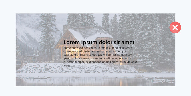
As mentioned in the above section on incorrectly spacing content, it can be a good idea to use negative space with background images where the content will become most effective to read.
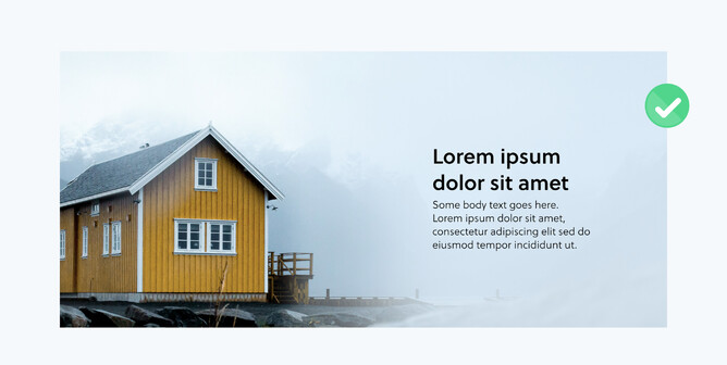
If you are struggling with finding that ideal image to fill a stack background or a page header, consider a single colour, a partial blur effect, or a gradient that fits the theme of your website.
Using blocks of colour can really help add emphasis and meaning to your written content. Solid colour backgrounds also work well on mobile, where sometimes images don’t work as well, so it’s also important to keep that in mind.