The designer’s deep dive into pictures for websites
Besides SEO, one of the most common topics designers ask the Rocketspark team about is picture files. Picture quality can really make or break a website, so I’ll explain how to avoid some of the most common mistakes when it comes to uploading picture files to display on websites.
Before eventually moving into a design career following university, I spent 6 months in what felt like the wrong degree. The Bachelor of Computing and Mathematical Science is a 4-year computer science and maths degree—not the place for a creative with an interest in design. In one of my papers, I did learn the computer science behind different file types and this has helped me a lot in the 15 years since. This post will unpack some of the science behind pictures, file types, compression, sizes and more—for designers.
Get a retina quality screen
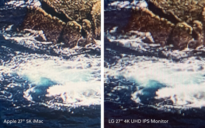
Before I jump into the details, one of the best pieces of advice I could give a designer is to get a retina screen Apple computer or high resolution 4K UHD or 5K screen. It isn’t about the physical width and height of the screen but more about how many pixels there physically are packaged into a square centimetre. For example, a 4K retina iMac 21.5 inch has a similar PPI to a 5k retina iMac 27 inch. The 27 inch is 5K not because the pixels are smaller per-se but more because the screen is wider. If you get up really close and squint, a 27 inch 4K UHD screen isn’t as sharp as a 27 inch iMac retina display but it’s the closest you can get without spending thousands on an external monitor—4K UHD would be my minimum recommended screen specs for a designer designing for the web.
In my print design days, I remember that 300 DPI (dots per square inch) was the standard for print. If a design was 300 DPI, there was enough detail in the file to not show pixels in the printed result.
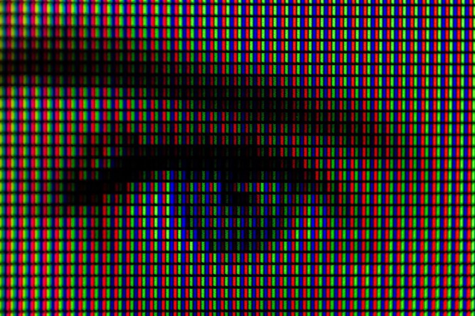
Retina screens are a little similar to this, with models ranging between 218 and 458 PPI (pixels per inch and the screen equivalent of DPI). This is around double the pixel density of many regular screens, so with a retina screen it’s virtually impossible to distinguish individual pixels when you squint and look really close—but as a result, you need to feed retina screens with enough pixels in your images so there is a pixel for every corresponding retina pixel. Displaying pictures with not enough detail on a retina screen will look similar to printing a 150 DPI picture.

As pictures on a website will be displayed at different responsive step sizes, my advice would be to get a large retina screen like on a 27-inch iMac or at a minimum a 4K UHD external monitor, so you can see the largest possible size that your client’s images might appear. The picture quality you uploaded and was auto-compressed by Rocketspark may be fine at a 15-inch laptop screen size but on a larger screen, a larger version of the image needs to be displayed.
Rocketspark applies compression
Attaching a picture file that’s too large, to an email, can affect deliverability with spam filters etc. So to prevent this from happening, we’ll usually compress the image and then attach it. The recipient however, will receive the original image in its exact uncompressed state. In the early years of website content management systems, when you uploaded a picture, it would display that exact image file just as if it were an attachment. However, over the years, website builders like Rocketspark have added sophisticated compression which takes the uploaded image and compresses it to be a good quality for the web without overcooking things on file size.
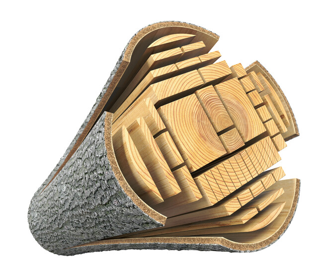
Think of the raw image like a log going into a sawmill. The sawmill mills that log into smaller, more refined pieces of timber. It’s still the same log but you need it to be fit for this specific purpose—not too big, not too small. Rocketspark’s in-built image compression is the sawmill.
Upload big images
Probably the most common mistake we see with pictures is simply not uploading a large enough image file.
For photos:
When uploading photos that don’t need any graphical elements added in a design programme, file size is the simplest clue to the amount of detail that’s packed into a photographic picture file.
Uploaded quality is like a spectrum from low to high and I would always err on the higher side. That said, it’s not always possible to get 5mb photos from every client. I would aim for all photos to be at least 1MB in file size, but 2-7MB is preferable (larger than that is fine, but upload times will be slower when adding lots of images) — then always check the quality of the uploaded image.

If a picture is several megabytes, it’s going to have a lot of detail in the picture—more than would be needed to display on the page but after Rocketspark’s automatic compression is applied you’ve got enough detail in the displayed picture.
If a picture is less than one megabyte, you might find that when you upload it through Rocketspark’s automatic compression, you end up with a picture displayed on the website that is too low resolution. Almost like trying to mill one of the half-round pieces of timber from the log analogy as a flat plank.
File size in megabytes isn’t a perfect science and is just a good quickfire way to grade whether photographic images are large enough before uploading.
For designed graphics:
If you’re mocking up your page design in a graphics programme with vector outlines, shapes and text, typically I would upload pictures in the 2500 to 5000 pixel width range and then check on a large screen once uploaded.

If you’re using something like Adobe Photoshop, Illustrator, Sketch or Figma to mock up a page design, you’ll likely be designing all of your elements at the size they would actually display on the web. However, when you export the different elements and upload through the automatic compression, the files will become over-compressed and low resolution/pixellated/blurry. If you’re mocking up your designs or graphics in this way, you will need to export your graphics at 4-6 times the width as they are in the design—overkill on what you’ll actually need but this way they should be plenty sharp enough when you upload them via the automatic picture compression.
The best approach to check if a file will be sharp enough is to base your size grading on pixel width and height. When you create your design files, rather than creating a file in CM or MM and then setting PPI, you are best to create the file using pixels as your unit. Pixels is related to the density of the pixels on the user’s screen. Different screens will have slightly different sized pixels (I’m talking the actual physical width of the pixel if you could measure it with the world’s tiniest ruler), affecting the displayed width for the same number of pixels from screen to screen, so CM or MM width/height are totally irrelevant. PPI of the picture is also somewhat irrelevant to screen design, as the PPI is set by the screen’s own PPI. Your job is to create images with enough pixels in them so that there is a pixel in the image for every pixel on the screen.

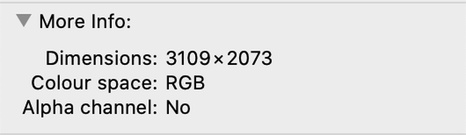
To find out the pixel width of your exported image (irrespective of PPI) on a Mac, you can right click on the file and click get info. It will then show you the pixel width and height of that file.
Even if a picture will be in a narrow column of a 4 column layout, it’s still worth uploading the picture at a size much larger than you need as the Rocketspark system stops you from displaying images that are too large—however, we can’t fix images that are uploaded too small and it’s inefficient to have to loop back through replacing images you didn’t upload large enough. Don’t forget about mobile as well. Apple’s iPhone X has a whopping 458 PPI, so what might look sharp on a desktop computer in a narrow 5 column layout column width could look pixelated on the phone when it’s sized to fit the width of a phone.

Example above shows a 5 column layout column.
File types—when to use what?
Rocketspark supports three types of image files: PNG, GIF and JPG but my recommendation would be to use PNG and JPG. As Google is now placing more emphasis on page load speed, using the right format for the right situation can really make a significant impact on your client’s page load speed.
When to use JPG
For anything photographic in nature, JPG is the best way to go.

While you can get a similar result visually with PNG’s for photographic images, JPG compression is much more effective at reducing the file size—so you’ll get a much smaller file size at the same visual quality, resulting in a faster loading image displayed on the site.
When to use PNG
When it comes to blocks of colour with sharp edges or text embedded in an image, JPG is less likely to look as sharp and in this situation PNG is the best option. If I recall my computer science paper correctly, PNG compression takes into account blocks of the same colour in an area of the image and is more efficient at compressing that than JPG.

So for large blocks of colour and shapes like in the examples here, PNG is definitely the way to go.

If I was designing a graphic like the ones on Rocketspark.com that combine what looks like vector graphics and photographic elements, I would lean towards PNG to maintain really sharp edges on the shape elements, sacrificing slightly on the higher file size for the photographic portion of the image. However, as the photographic element is only a small part of the image the file size won’t be as high as if you did an entire photographic image with PNG.

One of the other key advantages of PNG files is the ability to have transparency in the image (JPG doesn’t support transparency and the transparency support for GIF’s doesn’t give a smooth defined edge like PNG). If you want to display a logo layered over top of a photo background for example, this can be done with a transparent background PNG.

What about SVG?
SVG is a much newer file type than PNG and JPG and is actually a vector format. So rather than a picture being coded in pixels, it’s coded in mathematical lines and curves. In much the same way as a vector print design can be scaled up to the side of a plane without creating a giant sized file, SVG is efficient for file sizing even at large sizes on screens. Rocketspark's new picture block supports SVG uploads.
Vector icons that always look sharp on any device are a great reason to want SVG’s and using an icon provider like Font Awesome is a really easy way to add vector icons to a Rocketspark website without having to manually upload SVG files.
What about WEBP?
WEBP is another relatively new format. As of May 2020, it’s not possible yet to upload WEBP files to Rocketspark websites. However, in some places if you upload as a PNG file we will convert to WEBP. And the reason? Page load speed improvements. In some situations we can get the file size of PNG-style graphics down to a smaller file size by converting to WEBP while still remaining a good visual quality.
What about HEIC?
When I take pictures on my iPhone and then import them into my computer they come in as HEIC (as were the pictures I took of my screens earlier in the article). Currently it’s not possible to import HEIC files into Rocketspark and I converted these to JPG on my computer.
What about PDF?
PDF files can’t be embedded or displayed on a web page in their standard format. It might feel like you’ve seen PDF files in a web browser but these are always done in one of two ways:
Some browsers display the PDF in a new tab when you download that file. It’s not displaying the PDF on a web page, it’s displaying the PDF in a browser tab.
PDF flipbook embed tools like Issuu enable you to embed a multi-page PDF into the page of a website and lets you flip through the pages digitally like a magazine.
If you’re offering a downloadable PDF, another technique is to convert the first page to a JPG or PNG file and upload that as a picture block. Then you can add a link from that image to download the PDF file.
What about animated GIFs?
Animated GIFs are popular on social media and on websites (and we have an easy-to-follow help guide on how to add GIFs to a Rocketspark website) but there can be real issues with picture quality without sacrificing file size efficiency. On Rocketspark.com we have a number of autoplay videos embedded on our website that are a much higher resolution alternative to animated GIFs. This is as simple as uploading the video to a service like Vimeo and setting it to autoplay when you embed it on your Rocketspark website. So if you have an animated GIF, there’s no good reason you couldn’t convert it to a video and upload it that way instead.
RGB vs CMYK
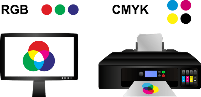
In print design, CMYK (Cyan, Magenta, Yellow, Black) is the combination of colours that go in the mix when doing a print run. In screen design, pixels are actually made up of three colours. There is a red, a green and a blue part to every pixel. Every colour you see on your screen is some combination of those three colours in varying degrees of brightness/intensity.
If you create a graphic in CMYK and then upload it to a website, you might notice the colours looking washed out or quite different to the printed version. It’s not as simple as just changing the file from CMYK to RGB in Adobe. You may need to change the RGB colour to the best visual match you can choose to match the printed CMYK version. Remember that designing CMYK on a screen is a little tricky as it never quite looks the same as it will when printed. By comparison, designing for the screen with RGB is much simpler as you’re seeing it in the native colour profile it’ll be displayed for website visitors—as you design.
Is there a max file size to upload?
There is a maximum file size when uploading images to Rocketspark but very few images are going to be created large enough to come close to that limit. I would be more focussed on not creating images too small than creating images too large, since Rocketspark automatically compresses large images down to a suitable size for the web.
