6 ways to take your website’s design to the next level
Here at Rocketspark, we see a fair number of websites pop up on our screens. Often they’re met with an "oh that’s nice" or an "I like what they did there." However every so often we come across a site that has an extra layer of polish and finesse.
How do you achieve that high-end professional look? Here are 6 easy tips to help you take your website’s design to the next level.
Embrace simplicity
We’ve found that some of the most engaging sites are actually the simplest. While it can be tempting to keep filling the page with images and text, sometimes adding too much does more harm than good. A cluttered website can be overwhelming for your visitors and might even scare them away. Focus on clear headings, vibrant images and a clean layout. Nail the basics and that’s all you’ll need.
Don’t be afraid of space
Using empty space is probably one of the most under-appreciated techniques in web design. You might think it’s a bit strange to purposely add in space, however, when used right it can actually draw your visitors to exactly where you want them to look.
Including extra space around elements also ensures your design never feels cluttered. Check out Rocketspark’s stack specific spacing options. You can adjust the spacing between each section of your website, helping create a clean balanced design.
Tip: Generally, we’ve found that a little bit of extra space is better than too little. Don’t be afraid if your page ends up being really long - web real estate is free!
Create contrast
How can you stand out from the crowd? CONTRAST. Whether that’s through font choice, colour or size, don’t be afraid to be bold. Bright background colours and call-to-action buttons are sure to attract attention. As long as it’s in line with your brand, there’s no reason why you should hold back.
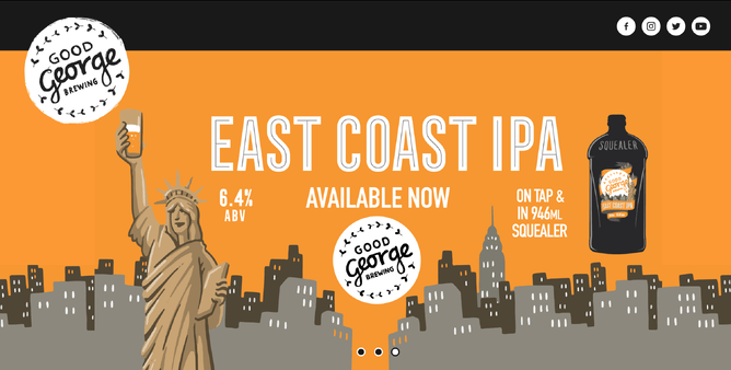
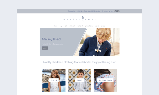
Use background images
Nothing looks more impressive than large full-width images. They’re visually striking and they can often say more than the text on the page. With Rocketspark’s stack background feature, you can easily add full-width images to any section of your website.
The beauty of stack backgrounds is that you can upload anything as your background image. Patterns, gradients or even just a solid colour. There’s plenty of room to be creative.
Tip: Background images can be visually powerful so it pays to have a bit of restraint. We recommend alternating photographic background sections with clean simple sections. It gives the eye a rest and will make your images stand out even more!
Want to really wow your visitors? Picture block effects are a super easy way to bring subtle animation into the design. There is a whole range of effects to choose from and plenty of options for customisation.
www.ginamadigan.co.nz uses picture blocks as an alternative to normal buttons.
Check out our Picture Block help guide and give it a try for yourself.
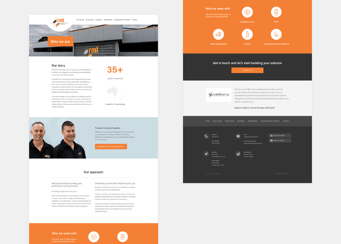
Make it visual
Text content is key when it comes to helping your website rank in search engines but it’s unlikely anyone will read ALL the text on your website. So, how can you make sure visitors actually take in the important pieces of information?
We recommended using images and icons to help communicate key messages. Not only will this make your website more scannable but it adds that extra layer of visual interest.
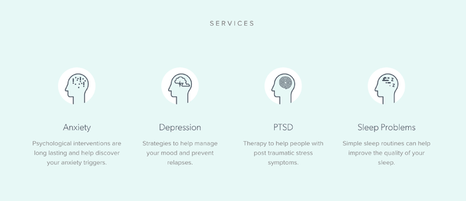
Tip: Flaticon.com has a great collection of icons to choose from. You can even add them directly to your Rocketspark website.
Now’s your time to shine
Adding that extra layer of polish to your website shouldn’t be an unattainable goal. In fact, we’ve tried to make it as easy as possible by giving you all the tools you need. Whether that’s adding impressive background images or animated picture effects, the power’s in your hands.
So, get stuck in and try one of the techniques out. Be careful though - you’ll have a hard job convincing others that you actually built the site yourself!