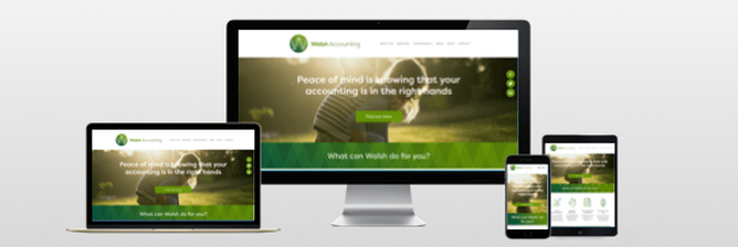
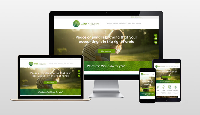
Fully responsive websites at every screen size — now on Rocketspark
In May 2017, we launched a fully responsive version of Rocketspark. This is a major upgrade to the way Rocketspark websites are optimised for every screen size — not just mobile and an average desktop size.
So what exactly is full Responsive Web Design?
With Responsive Web Design, you’ll notice that as you adjust the width of your browser window past certain width thresholds, the size of all of the elements on the page adjust in size relative to each other: text, images, buttons, block widths etc. The reason for this resizing is to preserve the design you created when you set up your site—by responding to different screen sizes, paragraphs are almost always the same number of lines at each screen size and wrap at the same point in the line.
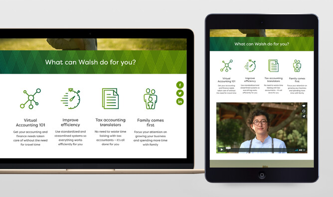
The other thing with small laptop screens is that the height is also less than larger screens. By scaling everything down in proportion more of the content can be viewed on the screen at any one time, rather than a single image taking up the full screen height for example.
Can I get responsive for my existing Rocketspark website?
When we were considering the upgrade from Mobile-Friendly to full Responsive Website Design, it would have been easy to roll it out only for new websites and leave existing customers on the Mobile-Friendly version—but the great news is that we decided to make it compatible with existing Rocketspark website templates. It’s been a huge amount of work but every Rocketspark customer can get full responsive and for most of them it is already switched on by default. We have identified that some customers have custom elements or very old templates on their website that make the switch a little more tricky. If this is you, you will see a notice in your mobile page of your dashboard advising you to contact Rocketspark before enabling responsive.
How do I view the fully responsive version of my Rocketspark website?
For a smooth experience while editing your website, fully responsive is disabled when you’re logged into Rocketspark. You can still view a mobile preview but if you want to see how the design of your site adapts for different window widths, log out of your dashboard and adjust the width of your web browser window. If you’re on a large screen, you will see a large desktop version, a medium sized desktop version, a smaller desktop version and a mobile version as you narrow the width of your window.
What’s new on the mobile version?
In addition to optimising Rocketspark for every screen size, we have also made some design and functionality improvements to the way websites are displayed on mobile devices.
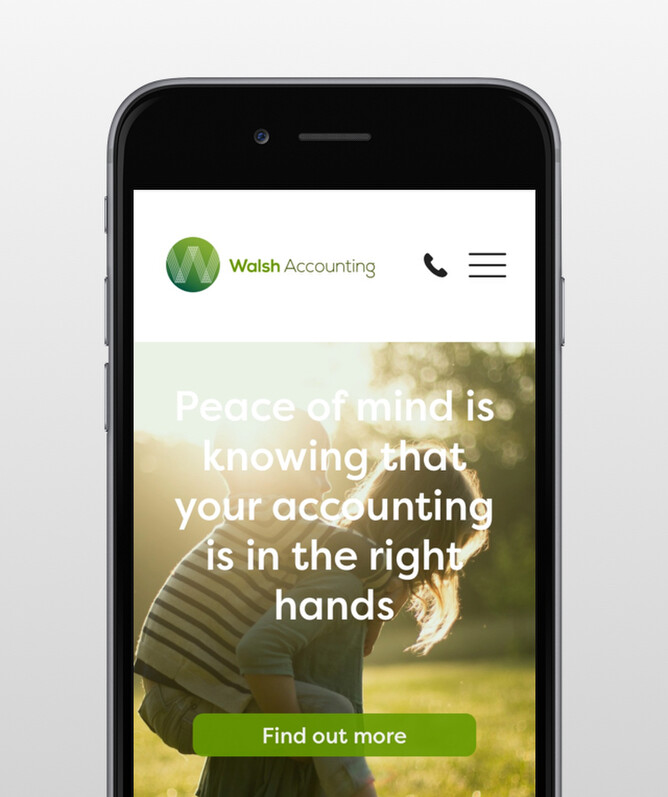
Previously, if you had your logo and/or text overlaying your feature area images, the text would sit below your feature area and the logo would appear above your feature area on mobile—but now the feature area text and logo both overlay your feature area on mobile.
Facebook and Twitter feeds are now visible on mobile, although because of limitations with Facebook and Twitter’s embed code these are only responsive when the page loads and not if you adjust your window width.
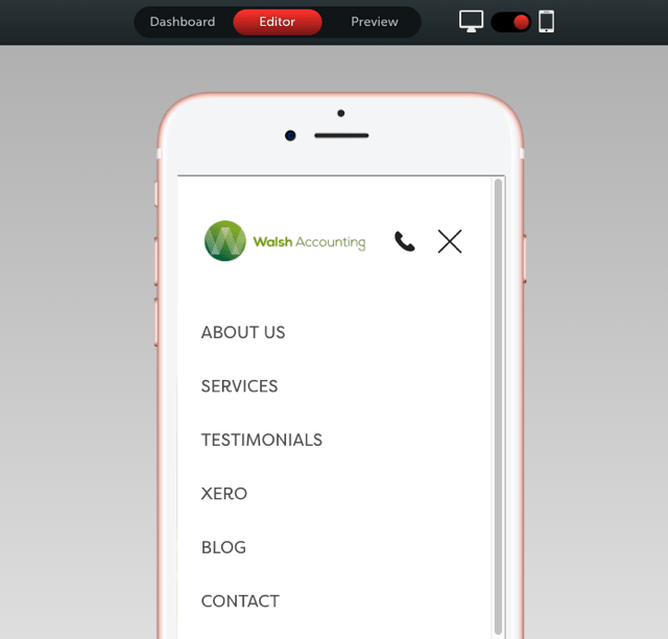
An all new mobile preview that’s fully interactive
Previously with the mobile preview inside dashboard it wasn’t possible to click on the actual preview and specific elements but that has changed with our new mobile preview. You can navigate your mobile site preview on your desktop computer, inside your Rocketspark Dashboard. This is especially handy if your site isn’t live yet and you can’t preview it on your actual phone yet.
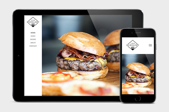
Out with an old template, in with a new
One of our least popular templates wasn’t going to work well with full responsive web design so we have taken it out of circulation. Existing websites that use this template can continue as usual with it but won’t be able to activate full responsive unless they change to a different template.
To replace the outgoing template, we have launched a similar but more modern interpretation of the old template, with a vertical menu bar that’s attached to the left hand edge of the window and has feature area images that span the width of the window.
Prioritising beautiful websites and best practise — doing the right thing
Across the hundreds of feature requests we get at Rocketspark, fully responsive wasn’t near the top in terms of number of requests. The technology that makes full responsive web design possible has been available for a number of years and we’re not an early adopter of it, so why did we make it a priority now despite the low number of requests for it? We are dedicated to helping our customers align their website with best practise and make beautiful websites, so we couldn’t put this one off any longer. We weren’t happy with how our websites were displaying on really large screens (over 24 inches), small screens (under 15 inches) and tablets, so we have worked hard to deliver a higher standard of design for all screen sizes.
Designers are often early adopters of website best practice and lead business owners towards change, and the majority of our requests for this feature have come from Rocketspark’s graphic design partners, who use the Rocketspark platform to design websites for their clients.
If you’re wanting to know more about the history of mobile-friendly websites and what’s led us to this latest version, check out our blog post about the history of mobile-friendly websites and responsive web design.