New Features: More font, size and colour options—and a whole new engine under the hood
Rocketspark has always been a website builder for the people – focused on ease of use for the small business owner, not the techie. Part of making a beautifully simple website builder has been the limiting of customisation options to just the most important design settings, so that you aren’t overwhelmed with thousands of settings—and because we're quite fanatical about your site having a consistent look and feel throughout, which makes it look more polished and professional.
However, for those who want more control and as the number of graphic designers using Rocketspark to design websites for their clients has been ramping up, we have launched a wider range of design customisation options.
We have balanced the expansion of design customisation with ease of use by enabling you to customise more detailed aspects of your template.
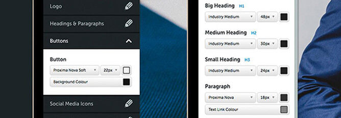
More heading and paragraph control
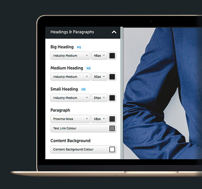
- Set the size, font and colour of specific heading types
- Paragraph text size and colour control
- Text link colour control
More button control
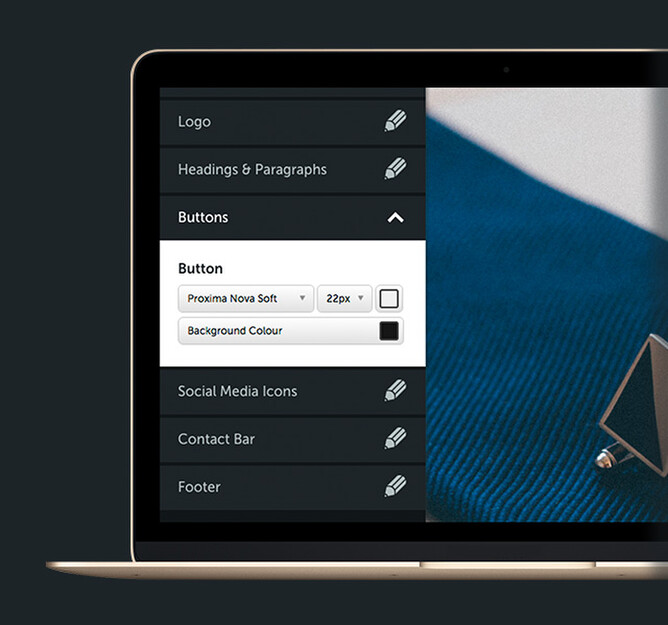
- Button text colour control.
- Adjust the size of your button text to make larger buttons.
Menu background colour
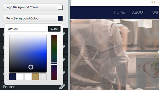
On some templates, the menu is separate from the logo area. For those templates, it’s now possible to set the menu background colour to be different to the logo background colour.
Full height feature area
The Rocketspark feature area is a great way to display large photographic images or a slideshow that spans the width of your window and even overlay text and buttons. Now when you’re editing the feature area, there’s an option where you can turn on full height feature area mode. This makes the feature area fill 100% of the available height of the page so that on all different screen sizes, the feature area fills the width and height of the window rather than scrolling on small screens and not looking tall enough on large screens.
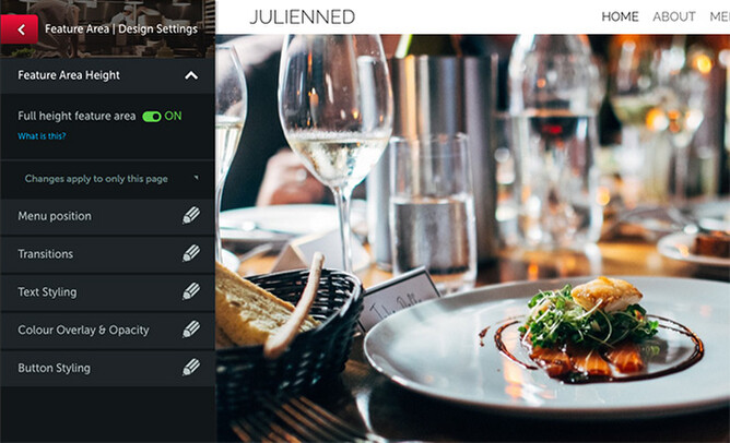
If you have content below the full height feature area, as soon as you start scrolling it will reveal the remaining content. Our new Julienned template is a great example of this and it’s a popular home page look for restaurants and architects.
Even more design options are coming
This update has been quite some time in the making as it was not just about changing a few controls that you now see. What we've created is a major update to our platform which will allow for a more rapid roll out of many of the other controls you've been asking for.
We have more button styling options coming soon, as well as an even wider range of design settings that are available to graphic design partners and those that are wanting to turn on that extra for experts experience – without tripping up those who are happy with the simple approach and don't want more detailed design options like line heights and letter spacing.
Please keep the feedback coming as it's your feedback that really shapes what we do.