At Rocketspark we’ve seen first hand that for many industries more than half of their web traffic is on mobile and for some clients as high as 80%. Having a quality, well-functioning mobile website is also key as Google bases website indexing and ranking in search results on the mobile version of your website first.
Rocketspark websites are already fully responsive to all screens, but there might be times (particularly for website designers and our Rocketspark Design Partners) when you want to create a specific look for your mobile site, so we wanted to give you more flexibility and control to do this.
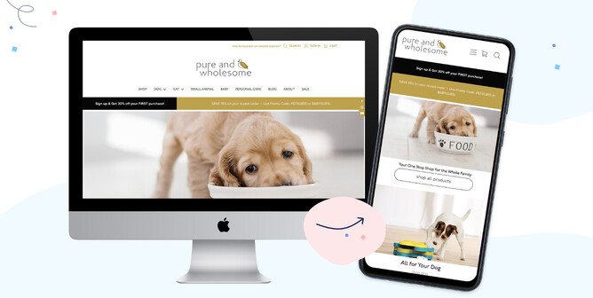
With our mobile-specific website design tools, it's easier than ever to get your website, or your client’s websites looking swish on mobile—giving mobile website visitors a great first impression that’ll encourage them to stay a little longer to send an enquiry, book a service or make a purchase.
1. Watch this 20 minute online class.
Watch this online class where we show you around our latest mobile website editing tools and give you tips on how you can create an effective mobile website that everyone will love to visit.
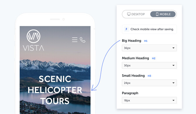
2. Start with sitewide mobile-specific adjustments.
Once you’ve set your sitewide design settings for your desktop website, it’s a good idea to check your site on your mobile device. Check that you're happy with the design look and feel of your Logo & Menu icons, Headings & Paragraphs and Buttons, then make adjustments using Rocketspark's Sitewide Mobile Design tools as desired.
Tip: You can add a tap-to-call icon on your Menu, by simply adding a phone number to your website’s ‘Contact Bar’. Our responsive platform will automatically create a 'tap-to-call' button on your mobile website, so your customers can call you directly with a single click. Check out our contact bar help guide.
Check out what other Rocketspark design features are available for your mobile website here.
3. Design a mobile-specific feature area.
The area on your mobile website that viewers see first should instantly grab their attention and inspire them to want to know more. This area holds a lot of weight for you and your business and we like to call it the Feature Area.
With Mobile Feature Area design controls, you can:- Show more of your image/s in the feature area on a mobile screen by adjusting the height of your Mobile Feature Area.
- Position your image’s focal point where you need it to be - simply slide your image horizontally to suit.
- Resize your heading text, blurb text and button text to fit your mobile screen.
- Adjust the position of your text by pinning it to a corner or edge of your mobile feature area so text doesn’t overlap the wrong part of your image.
4. Adjust column-layout to suit the mobile screen.
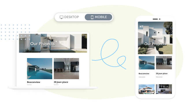
Stacks are layout sections on a Rocketspark website, giving you an easy, flexible way to design the layout of your website page, where each stack has its own column arrangement.
With our mobile-specific stack editing tools, you now have separate width and spacing controls, giving you control over column wrapping with either one or two-column layouts on mobile. You can also reorder your content within a stack to suit your desired design vision, and also set the text size separately for mobile.
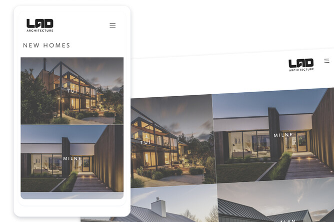
If you're using Rocketspark’s Grid Gallery feature in a stack, it's easy to change the number of columns and the size of your Title and/or Secondary text to suit your mobile website, with Grid Gallery's Mobile editor.
5. Try Preset Stacks for guaranteed mobile design success.
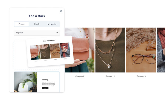
Preset Stacks gives you an incredibly fast visual way to add professionally designed section-layouts to your pages. With our library of Preset Stacks to choose from, the resizing and tweaking for the mobile screen has been done—saving you a huge amount of time, with peace of mind that your website will look great on mobile too.
You can still adjust design elements for mobile if you want to (things like headings and paragraphs, and content width and spacing), but if you roll with our standard Preset Stack settings it'll look great automatically. Learn more about our Preset Stacks feature.
Now that you’ve got your mobile site looking great, check out what else you can do with Rocketspark.
