The top section of any web page is key real estate and is critical to creating a great first impression on your website. Most modern home pages consist of a logo, navigation menu, main heading and large photo—without having to scroll down to see them (not that scrolling is bad, it’s just good to get the important stuff near the top). Arranging this combination of elements in a beautiful way without scrolling, can require some fine tuning to get it juuuust right. That’s why we’ve just launched a powerful-yet-beautifully-simple suite of design tools to give more control of the way your logo, menu and feature area text are displayed on the page.
Design freedom for maximum creativity
A beautiful tailor-made website is a combination of many well-designed elements on the page, masterfully fine-tuned to be in harmony with each other. Previously this level of customisation was limited to designers that can use highly technical tools or code—or a team of designers and techies playing tug of war between code and design.
At Rocketspark we have made it our mission to keep pushing the limits on the amount you can customise the design of a template without coding—and without having to change templates every time you want to modify your design.
This new suite of design features was shaped by feedback from our design partners—to remove any limits to their creativity. Just like many of our customers, our design partners aren’t usually techy, so these new features stay true to our beautifully simple philosophy.
You might be happy with your current design—that’s great—just know that these features are here when you need them. If you want to let your creativity go to the next level with more design freedom, you’re going to love these new features.
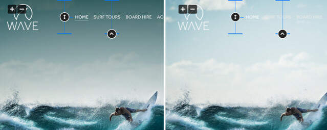
Adjust the height of your header and your menu position within it
Previously as you adjusted the height of your logo, this automatically adjusted the height of your header—but now it’s possible to fine tune your header height, to be as snug or as spacious around your logo as you want to go. You can also drag your menu up and down within your header to line it up with a particular part of your logo.
Header overlaying feature area
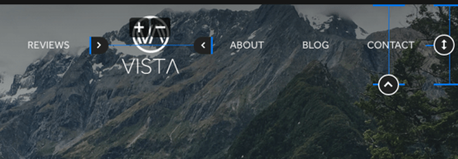
It’s now possible to overlay your website’s header (logo and menu) onto your feature area (large hero photograph at the top of the page). This is a popular design technique and where some designs can feel top-heavy with a solid band of colour at the top, this template feels light and open.
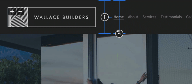
Another technique our design team has been using for a while now in our web design packages is to put a partially transparent background or gradient behind the header to help the logo and menu stand out. This might be a dark gradient to help white menu text stand out for example. This can now be achieved with standard code-free design options:
- Add a menu background and adjust the opacity and colour.
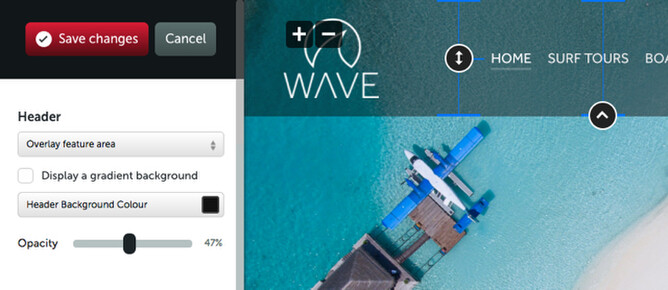
- Add a gradient to help your logo stand out against the photo backgrounds and adjust the gradient height, opacity and colour.
- On mobile, the image goes to the top of the design and when you expand your mobile menu, a nice background photograph is displayed behind your logo and menu text.
The new split menu template
We’ve launched a new template that opens up the possibility of positioning your logo in the centre, with your menu split either side of the logo. This template comes by default as overlaying the feature area but with the change of a drop down setting, switch to header above feature area.
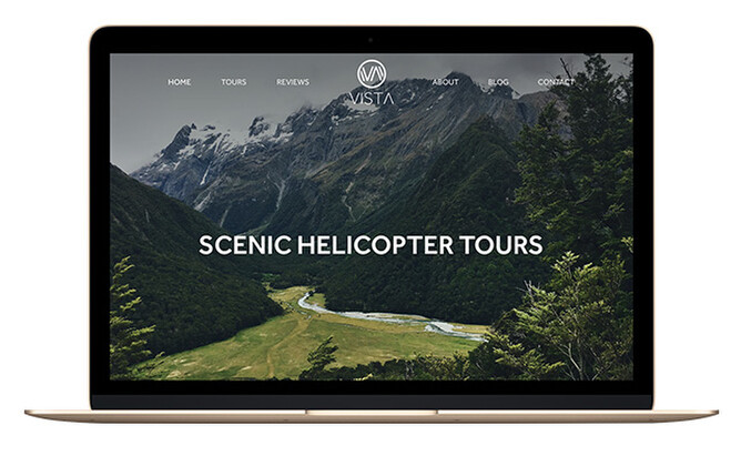
You can also adjust the spacing either side of the logo.
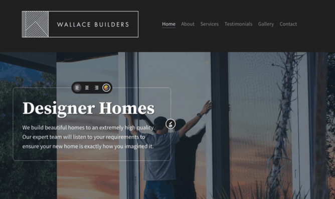
Feature area content width, vertical position and horizontal alignment are now in situ
You can now adjust the vertical position of your feature area text and buttons, as well as adjusting the width (hence setting the point at which text wraps onto a new line). This happens on a per-slide basis so you can adjust the width of your content to perfectly match your slide.
We’ve also moved the text alignment control in situ rather than having it in the feature area design controls area—plus we’ve put a shortcut from the feature area in-situ controls to the feature area text design settings.

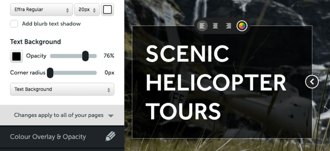
Add more definition to feature area text with text shadows and backgrounds
When you add text content over your feature area images, sometimes it can be detrimental to readability. Now it’s possible to add a subtle text shadow effect to feature area heading and blurb text. You can edit the colour, opacity, vertical/horizontal displacement and blur of the text shadow effect.
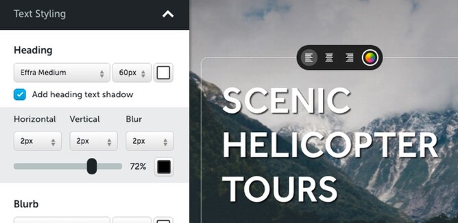
It’s also possible to add a background colour behind your feature area content, either encompassing the header only, the header and blurb only or the heading, blurb and button. The background has adjustable opacity and rounded corners.
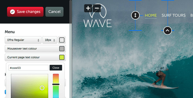
Menu mouse-over and current page text colour
Adjust your menu mouse-over, current page and default menu text colours independently of each other.
Making it easier to change templates
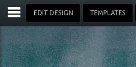
If you’re wanting to change to a different Rocketspark website template, the templates are now easier to find in the top menu by clicking on TEMPLATES (and CHANGE DESIGN has changed to EDIT DESIGN).
The popup we show you when changing templates has also had a redesign, so it’s simpler to understand the outcomes of changing templates.
You can leave the coding to the coders
These new features are powerful, easy to drive and give a level of design freedom you would usually expect from a custom coded design solution. Many of our design partners and do-it-yourself customers are coming to Rocketspark from other website systems and they love that with Rocketspark, they don’t have to worry about code or having to pay a web developer to help them.
If you already have a Rocketspark website and feel like you need some help to take your website’s design to the next level, why not get in touch with a Rocketspark design partner in your area. If you already have a graphic designer that you work with for your print design requirements, we’d love to introduce them to Rocketspark, so they can help you with your website too.