Read this.
See? It worked. A short, snappy instruction and you followed it. You’re now reading this blog post.
There are some imperatives we really want our website visitors to follow through on. For those things, we use buttons. A button isn’t just a link; it’s a flashy, shapely, alluring link that mellifluously whispers “click me”. Like this:
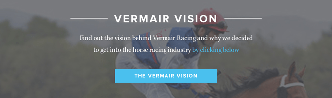
It’s what industry-types term a call to action, an invitation—nay, a summons—for your site visitor to contact you, sign up for your newsletter or just take the plunge and buy your product. It’s a high-stakes design element, so you really want to nail it. But we’ve noticed among our own customers an unbreakable rule that is often, well, broken:
It’s gotta look like a button.
Otherwise, it won’t get clicked. One common misstep is using more than one line of text on the button. That’s a problem for two reasons:
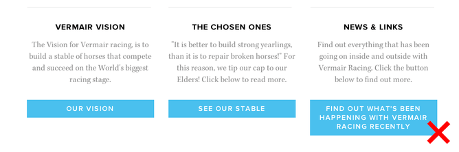
Readability. The copy on your button should be terse. You want it to be punchy, urging in as few words as possible your visitor to click. Keep it lean, spare and, most of all, one line.
Identifiability. Too much text can mess with the button’s shape. If you’re a Rocketspark customer, you’ll find that multiple lines will automatically increase the vertical dimension of the button. Then it’ll just look like text in a box, rather than a call to action. So, as a rule of thumb, keep your buttons mostly the same size and shape. Visitors will learn what a button on your website looks like. Anything that deviates from that look risks being overlooked.
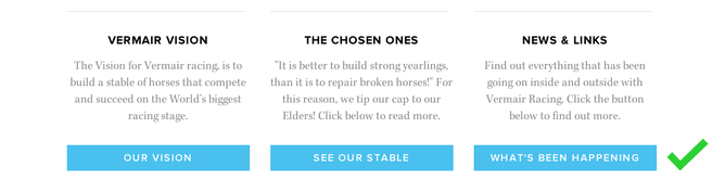
Now, you might be thinking: but I’ve seen lots of great buttons with more than one line of text. Ah, yes. These are multi-line buttons, which copywriter Joanna Wiebe describes as “single-lines on steriods”. Why? Because they still have just one line of prominent text. The extra lines give further information, but they’re usually smaller in size and secondary in importance.
They don’t take up much space, but a call to action button is one of the most crucial elements on your web page. If you’re a Rocketspark customer and you want to add buttons to your site, you might find our video on setting up buttons helpful. My advice is to stick to just one line of (prominent) text. Then your buttons will push all the right buttons.